Quantcast
Channel: TRIANGULATION
Viewing all 185 articles
Browse latest View live

Wade Guyton

$
0
0


"Wade Guyton's paintings are ostensibly black monochromes. Made with an Epson large format printer in the same manner as the paintings he has been producing for the last years, these works are printed on pre-primed linen intended for oil painting and not inkjet printing. As such, the images, marks, and letters Guyton continues to employ are absorbed into the porous material and disperse the ink rather than allowing it, as in his previous works, to "sit on the surface." Upon discovering this difference in the ink's interaction with the surface, the artist began to overprint his own paintings with a Photoshop-drawn rectangle "filled" with the color black. By repetitively overprinting, an unexpected painterly process developed. As each piece is created, they transcribe a visual record of the printer's actions: the trace of movement of the print heads, the varying states of their clogged-ness, the track marks of the wheels on wet ink all mixed with the scratches and smears on the paintings from being dragged across the floor to be fed back again into the printer." - Friedrich Petzel Gallery. See more;


Susie Rosmarin

$
0
0


Acrylic paintings on canvas by Susie Rosmarin.
"Susie Rosmarin makes colorful, eye-popping paintings that play with repeating patterns and variations of color. The works themselves are visually stunning, attaining many of the kinetic optical-illusion effects of op-art. To Rosmarin, though, the extraordinary visual effects are secondary to the fundamental, on-canvas changes of light and color. "I never set out to do [op-art]. It was a byproduct of my process. So I had to accept it and go with it. And I did."

In the mid-90s, Rosmarin became fascinated with mathematical patterns -- how things arrive at certain sums. Because of the nature of her process, Rosmarin has to wait until the end to see how the work has come together into a unified whole, a final sum. She doesn't know exactly how it's going to look until she pulls the last piece of tape off. When talking about why she enjoys painting, Rosmarin says very matter-of-factly: "Making something happen on a piece of canvas is really satisfying."" - David Feil. See more;


(Glitch) Art Genealogies essay by Rosa Menkman

$
0
0

Gridfont by A Bill Miller Image and interlaced Helvetica font by Rosa Menkman

Last March the (ᴳ̐litch) Art Genealogies exhibition took place at LEAP Gallery in Berlin. The exhibition statement said; "[...] The exhibition focuses on the different threads that interconnect generations of the different communities of visual (glitch) artists and their working methods, conceptual themes and problematics.
(glitch) Genealogies fragments Glitch history into multiple (historical) categories, such as ’NES-Aesthetics’, ‘Enigmatic realities’, ‘GUI, Politics and Prose’, ‘psychedelia and the new psychedelia’ and ‘discontinuous systematicities’"
Rosa Menkman, who curated the show together with Daniel Franke and John McKiernan went deeper, analyzing and writing about (Glitch) Art Genealogies. She launched the essay yesterday as a downloadable file  In this post you can see some fragments from the different categories and some references from artists who are part of the essay. See more;

NOTE All the information and references below are courtesy Rosa Menkman from (Glitch) Art Genealogies essay. The complete essay can be downloaded here.


(Glitch) Art Genealogies essay by Rosa Menkman


«Over the last 10 years, glitch, a perceived break from a flow in a technological system, has become a more and more popular subject matter in the (new) media arts. Today, Glitch Art is indeed so popular that theorists often feel the need to categorize and historicize the genre. Dada, Futurism and de Stijl are just a couple of historical Avant-Garde movements that have been used to delineate ‘the history’ of Glitch Art. But this teleological principle defies and confines glitch’ procedural and fragmented nature.

The exhibition (ᴳ̐litch) Art Genealogies does not focus on glitch art from a historically singular point of view, nor does it attempt to give an all encompassing historical or causal overview. Instead, (ᴳ̐litch) Art Genealogies recognizes the complexities and processes of glitch arts’ many affiliated, interconnected and (geo-)fragmented discourses: it tries to shine a light on why particular glitches develop social-political momentum in a specific point in time and how this momentum changes over time. 

(ᴳ̐litch) Art Genealogies is an effort to show just five of the many threaded glitch discourses that play a role in the curators subjective understanding of glitch art at this present. In these threads, generations of different communities of (visual) glitch artists and their working methods, conceptual themes and politics are (inter)connected and/or juxtaposed.» [...]


Psychedelia and New Psychedelia

[...] Psychedelic arts’ original aesthetics such as hallucinatory patterns, recursion, fractals and bright colors are illustrative to glitch, not necessarily because glitch artists have similar convictions or esthetic vision as 1960s psychedelic artists, but rather because of glitch arts’ algorithmic nature which was often referenced in 1960s psychedelic art. However, some glitch works seem to draw direct lines of inspiration or even knowledge (in the case of Anton Marini through collaboration) from these early times of counterculture. What does it mean to re-fabricate a genre 50 years after its coming about? And what is this ‘new’ in new psychedelia? 

gridSol_altar2 by A Bill Miller


Sect 7 N-E, 2013 by Anton Marini vs Rutt Etra


AURAE, 2012 by Sabrina Ratte 


GUI Politics and Prose

The collection Graphic User Interface (GUI) Politics and Prose shows glitch works that expand and explore the meaning and materiality of the GUI. Traditionally, the GUI functions to enhance the efficiency and ease of use of a computer program - in short: to enlarge 'usability'. But in these videos the GUI is exploited to enact a battle at the boarders of system and entropy, standardization and corruption, expression and code, and meaning and non-meaning, thwarting the viewers’ expectations and conventions of the ‘usability’ of a GUI.

JODIs early work My%Desktop (2002-2010) for instance, is best understood as a rejection of what can be referred to as GUI based ‘determinism’. At first sight, this series shows a collection of OS_systems going haywire, ruined and void of meaning. But the GUIs formal fragmentation or what seems to be a remarkably well choreographed spasming, forces the spectator to consider the work more closely. It seems like there is actually something more than just GUI-chaos on display. After reflecting upon the work for a while, it becomes clear that JODI is actually performing the GUI. The conventions I am conditioned to approach a GUI with, are left behind and instead the GUI has been deconstructed into a performance tool and maybe even something close to a writerly software. [...]

OS Desktop from the My%Desktop series, 2002-2010 by JODI


Plugin Beachball Success, 2012 by Jon Satrom


Post_it_desktop_Feedback, 2012 MiYö Van Stenis


NES circuitbending esthetic

Circuitbending is the customization of the circuits within electronic devices such as children's toys, to create new musical or visual instruments generating output beyond their original capabilities. It involves a certain threshold of knowledge and expertise - ie. a basic understanding of electronics and its tools. [...]

The concept that a glitch can be designed or distributed through a standardized glitch software, seems at first maybe a-typical, but has in fact become a more and more common tendency and even important tradition in recent glitch art. More and more ‘new’ glitch art is being modeled after original glitches within older media, perpetuating a shift from destabilizing breaks within technology or information-based processes towards the generic and associative display of more and less ‘retro’ effects. [...]

The Punch-Out! Variations, 2007 by noteNdo


glitchNES, 2009 by no_carrier


Enigmatic Realities

A video card barfs misunderstood RAM, all clipping modes are off, navigation causes environments to warp into all kinds of impossible angles while traces of passed imagery seem to get stuck in the sky and color modes have chosen to celebrate the 60s psychedelia once again. In these six game engine based ‘realities’, the rules of the frameworks that the player normally uses to make sense and navigate their videogames with, are intentionally ruined. [...]

The fact that the game environments still ‘function’, while programmed to ‘glitch’, makes them critically challenging. The gaming platform is in fact redefined to not follow its genre, form or technique and force the user to reflect upon her conventional frames of reference for the particular platform. Finally it becomes clear that software is more than just a preprogrammed tool: it is a materialization of social modalities, that can endlessly be re-modified into different interpretive or social conclusions. [...] 

RANDOM SEED, 2013 by Rick Silva


Psych and Seek 2013 by Kevin Carey


Authorship // Openness

Primarily active during the 70s as both activist and video artist based in and around Chicago, Phil Morton (1945 - 2003) wrote "Distribution Religion", a manifesto based on a conviction best understood as what today is known as ‘copy it left’ (but which Morton dubbed COPY RIGHT). Distribution Religion included the first DIT ‘open sourced’ schematics for an image processor, made by Dan Sandin. Mortons legacy also includes the film and video department of the the School of the Arts Institute Chicago, which Morton instigated and which is believed to be one of the earliest institutionalized film and video departments in the world. 

Mortons convictions still resonate in current video art practices of (SAIC/Chicago based) artists such as jonCates, who initiated the Phil Morton Memorial Research Archive in 2007, and Nick Briz whose Apple Computers (2013) is a [re]mix of Phil Morton's 1976 video tape 'General Motors'. In these (dirty) new media manifestos, Briz and Cates perform their take on issues of ‘Hystories’, planned obsolescence, upgrade culture, technological self-reliance, control and copying.

General Motors, 1970 by Phil morton


!"⟲#3! ⟒Ɍ3"""⟳Ɽ̂ ồ (AKA: Broken Records: Hystories i Of Noise && Dirty New Media), 2011 by  jonCates


Apple Computers, 2013 byNick Briz


Rosa Menkman, July 2013


Visual documentation about the show at LEAP Gallery; pictures here and videos [1] & [2]
Arte made a nice short documentary about check it out here, in german though.

Modulated Horizontal Lines

Video Death by Henry Driver

$
0
0


Video Death by Henry Driver_
"The documentation of a monitor as it deteriorates and loses all grounding. Forced to repeatedly display footage of its own decay, it slips into insanity. Confronted with mortality and the falseness of eternity, it self-destructs. Unable to be human and create an illusion of immortality or stability. It is consumed." - Henry Driver. See more;


Scans by Bruno Levy

$
0
0


Interesting digital scans made over reflective surfaces such as aluminium wrap and plastic wrap created by Bruno Levy who moved the surfaces during the scanning process in order to capture the analogue distortion. See more;

POLYVINYLIDENE CHLORIDE / scans, 2013


ALUMINUM / scans, 2013


Photoshop Cs5 Filters Animation

$
0
0


Device made a tribute to Photoshop Cs5 filters which have been animated and applied over the Photoshop logo in order to show the distortion effect of each filter. See more;


The Pirate Cinema by Nicolas Maigret

$
0
0


The Pirate Cinema by Nicolas Maigret_
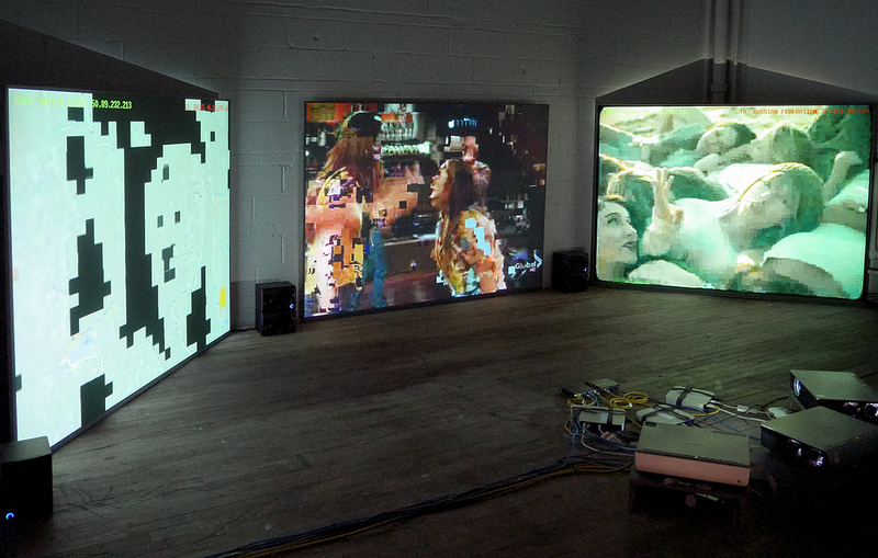
"In the context of omnipresent telecommunications surveillance, “The Pirate Cinema” makes the hidden activity and geography of Peer-to-Peer file sharing visible. The project is presented as a monitoring room, which shows Peer-to-Peer transfers happening in real time on networks using the BitTorrent protocol. The installation produces an arbitrary cut-up of the files currently being exchanged. This immediate and fragmentary rendering of digital activity, with information concerning its source and destination, thus depicts the topology of digital media consumption and uncontrolled content dissemination in a connected world." - thepiratecinema.com. See more;

Detailed presentation

"THE PIRATE CINEMA : TPC is based on a data interception software. It reveals, through a simple diversion, different aspects of exchange platforms, such as the global and multi-situated nature of Peer-to-Peer networks (P2P), the potential for viral transmission, and alternative social models. Its purpose is to make available for aesthetic exploration the pre-existing potentials of Peer-to-Peer architectures.

[A] VIDEO INSTALLATION VERSION * The video installation of TPC relies on an automated system that constantly downloads the most viewed torrents. The intercepted data is immediately projected onto a screen, after which it is discarded. Depending on the exhibition space, the installation involves one to five computers, each one monitoring specific categories of files. This allows the system to visualize fragmentary files received and sent all over the world.

[B] LIVE PERFORMANCE VERSION * The live performance of TPC relies on an automated system that downloads a selection of torrent files (movies, mp3) selected by the performer. This system is an instrument in itself, producing specific temporal and formal structures, from parameters defined by the performer. The performance lasts the amount of time required to download a group of files. The choice of the downloaded files may be related to the local or actual context. (Place, local cultural context, political, economic, etc.)"

See The Pirate Cinema context and more information about the project at thepiratecinema.com

The Pirate Cinema by Nicolas Maigret - Software development by Brendan Howell - Production by ArtKillArt, La Maison populaire, Eastern Bloc.


Shift by Media Lab

$
0
0


Shift, an interactive audio visual installation created by Media Lab in 2011. 
"Shift is an array of machines shifting bits and bytes informed by simple and highly repetitive algorithms. Shift pays attention to its environment through the ever-watchful eye of a built-in camera and responds to movement. Changes in state are expressed through audio and visual abstractions." See more;

"During the exhibition, the audience was able to interact with Shift through the build in web-camera of each individual computer. Activity sensed by the camera would result in visual and audible changes animating the audience to further explore the underlying system of the work through different forms of gestures. 

How did the software work? To get started, Andreas prepared a software template, a sketch, that would be used by each individual member of the project. By tweaking and changing parameters and the structure of the software code, new and different mutations of the initial program would emerge. We ended u choosing 20 variations to be displayed. In the next step interactivity was added to the sketches. Since each computer that we were using was equipped with a web camera, we added a code that would allow us to capture, analyze and translate the camera feed into an additional parameter for our sketches."

The algorithms are shaped by Andreas Schlegel, Benson Chong, Darrick Ma, Dhiya Md, Felix Sng, Marvin Liang, Mike Chen, Sid Lim.


Akihiko Miyoshi

$
0
0


Interesting works and studies by Akihiko Miyoshi_
“Throughout my career I have been exploring the intersection between art and technology most frequently dealing with issues surrounding photographic representation. My works often reveal the conventions of perception and representation through tensions created by the use of computers and traditional photographic techniques.The photographs included in Abstract Photographs series are of mirrors, paper and tape often adhered to the surface of the mirror taken with a large format camera as they attempt to unpack the structural mechanics of photographic representation." - Akihiko Miyoshi. See more;

Abstract Photographs

"While the images allude to formal abstraction with various shapes and colors, the photographic nature of the images are emphasized as the image plane is selectively focused and blurred through the use of depth of field. The usually referencelessness nature of abstraction is contradicted by the presence of minute details captured by the use of a large format camera such as dust and scratch marks found on the surface of the mirror or the texture of the tapes used which makes the images photographically real and almost sculptural. These images have a duality (and tension) of being simultaneously abstract and photographically real. 

Further, as with many of my other works the photographs expresses my interest in the effect of digital technology in photography and its aesthetic. For example the choice of red, green, and blue tape is based on the three primary colors that constitute a pixel. From a far the tapes can be seen as the pixels glowing on the computer screen. While the images are made using primarily traditional photographic methods, they reference the new aesthetic that seems to be emerging as a result of the use of digital tools and technologies. Seen in this context, by always including only the silhouette of the photographer with his camera, the images remind the viewers of the presence/absence of the producer/author and the method."


18% Gray, 2010

"A "gray card" which has 18% reflectance is commonly used in photography as a reference to produce consistent exposure. We tend to think of gray, white, or black as neutral colorless color but in fact they are usually created using a combination of three primary colors. The piece "18% Gray" deconstructs this by effectively using depth of field, another photographic trope."


A Situation to be Viewed Through a Video Camera, 2010

"An installation consisting of a physical object (cardboard), a projected image (of a grid), and a video camera. The viewer is asked to view the installation through the video camera. The piece explicitly acknowledges and makes it an issue for itself how the viewer's perception is constructed by asking the viewer to see and acknowledge the effects every element has on the final view/image. At first, the viewer only sees a cardboard with light being projected on and a video camera pointed towards the cardboard. The "aha moment" occurs when the viewer looks through the video camera which turns a mundane scene into an aesthetic experience. One sees the cardboard, the projected image of the grid, and the rolling rainbow banding effect moving horizontally or vertically introduced by the video camera (created when the frame rate and the refresh rate of the projector are out of synch) combined to create an abstract picture. Upon seeing the abstract picture through the video camera, the viewer at last recognizes it as an aesthetic experience. It was made by a desire to create a piece that one had to see in person. Today most images produced are completely immaterial, captured on cell-phones and shared on social networking sites very rarely existing as an object. Photography has dislodged itself from its material substance and is about information and the transmission of information than anything else. If one can instantaneously download and view images that are art or of art, shouldn't we be asking ourselves "Why do we go see art, especially the photographic kind, anyway?"


RoRsesResoR, 2010

"A color video image of roses is projected onto faux roses that are spray painted white. The projected image creates the impression that the roses are colored. Upon close inspection the viewer sees that the image is slightly misaligned with the object and recognizes the separation of image from form. Further, the projected image very slowly separates itself, just as it has from form, into three primary colors that constitute the image."


THIRTY THREE by Nils Völker

$
0
0


Thirty Three, 2013 by Nils Völker_
"The intensity and direction of the waves are determined by the actual tides at the harbor of Le Havre which is the subject of Claude Monet's painting "Impression, soleil levant" from 1872 and which gave rise to the name of the Impressionist movement.

Approximately every six hours, when the water level reaches its highest or lowest point, the wavelike movement of the installation slows down until it restarts towards the opposite direction. Also the intensity of the waves changes from day to day, according to the height of the tides at that time." - Nils Völker. See more;

Thirty Three is a site specific installation for a solo exhibition inside the Eglise du Vieux St-Sauveur in Caen curated by David Dronet, Station Mir within the frame of "Festival Normandie Impressionniste". The exhibition runs until 1st September 2013 and is open from Wednesday until Sunday, 15:00 till 19:00.


Making of
mylar, cooling fans, pvc, wood, custom made electronics and programming - approx. 17 x 1.5 x 2 m 


3dGif by Vince Mckelvie

$
0
0


Vince Mckelvie made a new project called 3dGif, consisting in a webGL based website where it's possible to submit an image, not only are allowed animated GIFs but static formats such as JPEG and PNG to texturize a three-dimensional animated environment where there is an organic form moving into a rotating cube, this example shows pretty well the space of. The form in the centre follows a similar animated structure than some GIFs created by Vince. 3dGif is another great project where the collaboration of Tim Baker is present. See more;

Preferable use Chrome and/or Firefox


MAPS by Kim Asendorf

$
0
0


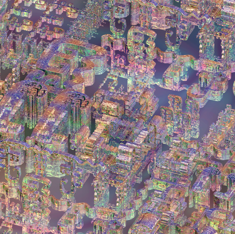
Kim Asendorf just launched MAPS a new beautiful project where the maps are translated into abstract colourful compositions. There is not text either indications only there are some random functions which are applied every time the user refresh the page such as zoom, position and colors to get different results. It has been created using Google Maps technology actually Kim used the same way for the URL of the project than Google does, like maps.kimasendor.com a detail I really liked. Explore it by yourself, it can get more abstract as deeper you go. See more;


Paul Prudence

$
0
0


Apeiron and Cyclotone are some beautiful live A-V works created by Paul Prudence using different algorithmic strategies, check out more interesting generative pieces on his site. See more;


Apeiron [fragments], 2013
"Apeiron explores the phase transitions and shape transmutations of a set of complex nested spherical harmonic forms modulated by sound. The apeiron, central to the cosmological theory created by Anaximander in the 6th century BC, means limitless, infinite, or indefinite. Anaximander believed that infinite worlds are generated from apeiron and then are destroyed there according to the principle of genesis-decay." - Paul Prudence.


Cyclotone [intro], 2012
http://www.paulprudence.com/?p=337

"Cyclotone cross-wires sound and video material to create multi-modalities using a variety of algorithmic strategies, further synergies are created by employing associative, metaphorical and perceptual bindings between the visual and sonic domains. The work takes conceptual cues from cyclotrons and particle accelerators and is inspired to commemorate the first wave of Russian cosmonauts who conquered space physically as well as the artists of the Constructivist movement who conquered space conceptually." - Paul Prudence.


Evolution Of Silence by Matthias Lohscheidt

$
0
0


Evolution Of Silence, 2013, an interactive sound-installation by Matthias Lohscheidt.
"The work »Evolution Of Silence« portrays a virtual world populated by artificial creatures. Each creature creates a tone defined by its DNA, and is visually represented by a ray of light inside a holographic projection. The population of these creatures evolves steadily in an evolutionary algorithm. The virtual world provides an inaudible key as an environmental condition. The more the tone of a creature fits the key, the louder its tone sounds, the stronger and broader its ray of light is, the more attractive it is to the other creatures and the longer it lives. Thus, it can produce many offspring by mating other creatures. Deviant tones however are quiet, have a very thin ray of light and die relatively quickly.
This way, the population inside the world evolves from a disharmonic and chaotic soundscape to a harmonic structure, fitting more and more to the key provided by the environment. After two to three minutes the environment key changes randomly, and the soundscape immediately becomes chaotic again. The population will adapt to this new environment over the period of several generations." - Matthias Lohscheidt. See more;


"The visitor can influence the evolutionary process by touching the rays of lights belonging to the creatures and thus “feeding” them. If the weak, quiet creatures with deviant, disharmonic tones, a thin ray of light and imminent death are touched or “fed”, they immediately become strong and loud. Thus, they are much more attractive to the other creatures and can produce many offspring. So the process of harmonising controlled by the evolutionary algorithm will slow down and be complemented with disharmonies.

»Evolution Of Silence« is the result of a series of experiments where I applied evolutionary algorithms to the emergent generation of sounds. Following JOHN CAGE, »Silence« is interpreted as the occurrence of all sounds that arise inside an environment by the very existence of all beings and elements – without any intention associated with those sounds: The artificial beings of the virtual world don’t sound to fulfill a musical purpose, they just sound because they exist. Only the environment with its progressing evolutionary process judges every tone and sets it into a harmonic context. This context attributes an intention to every tone, that is however, only valid within this context." - Matthias Lohscheidt.

Technical Information

All software is written in Java based on the Processing-library. The sound is generated with SuperCollider, which is controlled by the java-application through the great SUPERCOLLIDER-CLIENT for Processing by Daniel Jones. The tracking has been realized with a Kinect and Daniel Shiffman’s OPENKINECT-LIBRARY.

List of all used libraries:TOXICLIBS by Karsten “toxi” Schmidt, DNA by André Sier, OPENKINECT by Daniel Shiffman, PROCESSING-SC by Daniel Jones, OSCP5 and CONTROLP5 by Andreas Schlegel, ANI by Benedikt Groß


Gemis Luciani

$
0
0

"Gemis Luciani manipulates, de-composes and re-assembes common objects such as design magazines, phone books and 3D architectural renderings, he reconfigures them in newly built systems of shapes and surfaces. His collages and spatial, large scale installations are meticulously created, and rely on a strong minimalist aesthetic." See more;


Marginal Compositions, 2013
magazine on dibond with frame / 40cm × 50cm  x 5cm

"Marginal Compositions is a project in development centered on the investigation of a marginal space’s aesthetic qualities. The works are realized with various magazines. Every magazine’s page is folded in a way to erase the textual element of the previous page and to leave only the margin visible. The compositions are produced by repeating this action until the magazine’s surface is completely covered. Every work is a representative but not definitive image documenting this kind of space’s expressive potential."


Models, 2010
magazine on dibond / 40cm × 60cm  x 3cm

"Models is the title of a series of collages created by systematically folding fashion, design, music and architecture magazines. Each "model' represents a typology of movement within the enclosed layout of the magazine. Each page is folded upon the other so as to hide the text  of the previous page. This forms a flow of visual elements, a series of fragments that articulate vertically on the entire surface of the magazine. “Models” is a methodology for the construction of an image which interacts with the spatial organization of paper-based communication through a different compositional model."


Piece of Space, 2011 -13
phone book / 40cm × 30cm x 18cm

“Piece of space” is a research project on the relationship between word and image in the visual representation of urban spaces. The works are realized using telephone books, cut and fixed to the wall.


Flexible Shapes, 2013
 telephone directory of businesses / 40cm × 20cm x 10cm

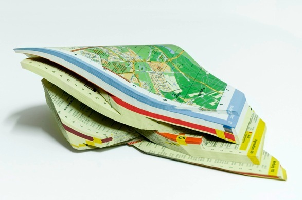
"Flexible Shapes is a research project about a sculpture’s morphological flexibility,  made of a series of 10 pieces realized inposing an intervention onto a numer of Yellow Pages books. The works are modified after every public exhibition. The work’s transformation, the shape’s durability and its persistence in time are all defined by the exhaustion of the formal possibilities offered by their pages’ sharp cut. The works are exhibited as plastic temporary configurations of an object, until they reach a more permanent sculptural definition."


Liquid Vehicle Transmitter by Brenna Murphy

$
0
0

Liquid transistor resonancy valley, 2013 - Archival pigment print mounted to Dibond

Brenna Murphy's new exhibition "Liquid Vehicle Transmitter" will be at YBCA (San Francisco) till next September 8, a show curated by Ceci Moss.

"Brenna Murphy begins each new work with a digital image file and proceeds to manipulate it across multiple applications—Photoshop, Blender, After Effects, and more—to create a unique, artificial aesthetic. Patterns recur at various scales, imbuing her structures and environments with a mesmerizing, hallucinatory effect. We are invited to negotiate our own place within this realm, and sync in." - Ceci Moss. See more;


"Recalling the kinds of interactions with digital screens that have now become second nature—zooming, clicking, scrolling—Murphy’s video games, mindbending prints, websites, and intricate installations require us to physically, mentally, and visually navigate a terrain. The artist often refers to the structure of the labyrinth as a central concept across her multidisciplinary output, and its logic is a major factor in dictating the viewer’s orientation within a work. […]

Murphy’s YBCA exhibition, Liquid Vehicle Transmitter, seems to offer up yet another form, the emergent labyrinth. It transports the visitor to an alien universe where obsessively detailed compositions morph and slide into one another. Like the strange, shifting interiors found in the video game exhibited in this show, Nightscape Navigator, new things appear as you move forward. The path is never set, but seems to reconstitute itself afresh as you take each next step. […]

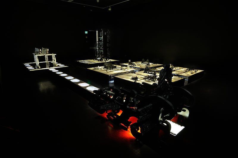
Like all of Murphy’s work, her new installation emergent entity chant array seeks an attunement with the viewer. Dizzyingly intricate, it permits multiple entry points on the visual, physical, and sonic registers. Murphy’s interest in audience engagement also informs her involvement in two different art collectives, MSHR and Oregon Painting Society. These groups use unique handmade electronic instruments to experiment with performance, sound, sculpture, and installation. They transform the surrounding environment into another domain, bringing about transcendent happenings that test the audience’s sense of reality." - Ceci Moss, Assistant Curator of Visual Arts


Liquid Vehicle Transmitter digital prints
Archival pigment prints mounted to dibond
Images courtesy American Medium


Opal twins, 2013

Sky lattice, 2013

Insect vehicle, 2013


Nightscape Navigator
download for Mac and PC
Nightscape Navigator is part of MSHR, a collaborative project by Brenna Murphy and Birch Cooper.


Emergent entity chant array
Installation


Don Slepian

$
0
0


Don Slepian made Sunflower Geranium in 1983 a video compilation of live performances showing different visual effects created through a custom array of specialized hardware and software to mix synthesized video imagery and original electronic music for a live audience. One of my favorite parts of Sunflower Geranium is at the end where there are several short animations working through pixel based geometric shapes, Slepian explains to Rhizome how he produced them; "is the output of one of my original CEEMAC scores in which I attempt to create texture and dimension using diffraction patterns and chroma shifting. In Apple II "Hi-Res" mode I was working with a 280px by 192px screen, 57 thousand pixels in all. A far cry from the 2.0736 million pixels we take for granted in standard 1080p video frames.
Into the post you can see these short animations as animated GIFs but I highly recommend to watch the whole piece and read an interesting interview with Don Slepian about the process of at Rhizome. See more;


International Teletext Art Festival 2013

$
0
0

Black & White by LIA

International Teletext Art Festival 2013 will end next September 15, it's being displayed in Berlin at ARD Hauptstadtstudiohttp://www.ard-hauptstadtstudio.de/ exhibition space, but it can be seen also though original teletext pages such as in ARD Text from page 850, ORF TELETEXT from page 470 and SWISS TELETEXT pages 750-764 on SRF 1, RTS 1 and RSI 1.
ITAF includes this year great works from Max Capacity, Cordula Ditz, Daniel Egg, Dragan Espenschied, Dan Farrimond, Goto80, Kathrin Günter, Juha van Ingen, Manuel Knapp, John Lawrence, Marc Lee, LIA, Raquel Meyers, Seppo Renvall, Jarkko Räsänen and UBERMORGEN, and a jury formed by Paul B. Davis, Voin de Voin and Rosa Menkman.
Into the post there are only two geometric and abstract based series I like from LIA and Juha van Ingen, but check out all the works at www.teletextart.com. See more;

"Considering that teletext has been used by millions of people daily during its 40 years of existence, it has so far remained a relatively unexplored territory for artistic creation. Ever since it was launched by the BBC in 1973, there have been several serious efforts to open up teletext for art but even if teletext has had a steady stream of fans within the artistic community, including some well-known names such as the Jodi artist collective, it has never gained the status it deserves as an art form. Now that High Definition has become established as a standard and the race towards crisp images has slowed down, a growing number of artists have returned to the basic structures of electronic art. This can be seen as the main reason for the revival of teletext in this context. Other phenomena explaining the sudden interest in teletext art, especially among young artists, is the retro factor. The minimal aesthetics and limited technical possibilities make teletext a unique medium and also an interesting challenge for artists: To make teletext pages a specific file format and editor are needed. A teletext page can be perceived as a grid of 24 rows and 40 columns. To change the colours of the graphics, text and background or to add a blink effect, a control character needs to be inserted. Each time a control character is placed it uses up one space in the grid, which then appears black. The artworks can be viewed with teletext editors or made into animated images but the true forum for teletext art is of course teletext itself. A group of experts (Paul B. Davis, Voin de Voin and Rosa Menkman) will select one of the participating artists to receive the Teletext Art Prize.You too can vote for your favourite artwork by SENDING A POSTCARD more info about voting here.

The festival opens on August 15th in Berlin at the ARD Hauptstadtstudio exhibition space were the ITAF works will be displayed untill the 15th September and continues in Filmkunstbar Fitzcarraldo with some program. The following day ITAF continues with a Teletext Cocktailparty in Musterzimmer Showroom for Contemporary Art. > info on opening program, schedule and locations ITAF2013 will also be in the program of Ars Electronica Festival , Linz, Austria, 5.9.-9.9.2013

The International Teletext Art Festival is a FixC cooperative project www.fixc.fi made in collaboration with ARD Text www.ard-text.de, ORF TELETEXT teletext.orf.at and Swiss TXT www.teletext.ch." - www.teletextart.com.


Black & White by LIA

"In the five works that LIA created for the teletext art festival she uses the single pixel as basic building blocks. The images play on the one hand with the idea of algorithms, by varying the distances between lines and pixels following algorithmically defined patterns; and on the other hand with the intense contrast between black and white elements demanded by the limitations of the technology. In four of the five works the teletext "flash" command is used to provide a hierarchical order of the elements without using animation as such. A clear boundary is formed between the permanent (static) and impermanent (dynamic) elements; this boundary appears and disappears as the blinking effect plays out. If the entire image were always visible, ie if there was no blink effect, the dynamic elements would be lost amongst the static elements."


The Tale of Tomorrow by Juha van Ingen

The work by Juha van Ingen for ITAF2013 was inspired by 'Sunset' a painting by J.M.W. Turner


via | Rhizome

Pablo Valbuena

$
0
0


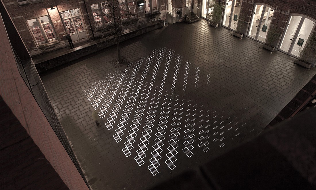
Two new works by Pablo Valbuena who has always kept one of the cleanest minimalist style working through videoprojection on architecture, recently Pablo made time tilings [stuk] consisting in four site-specific interventions at Artefact festival in STUK Kunstencentrum. Leuven, 2013. 
The other new work called chrono-graphy [max estrella 2013-2010] is a site and time specific project using black paint on walls, floors and ceilings at Max Estrella Gallery in Madrid, 2013. See more;


time tilings [stuk], 2013

"Architecture is judged by eyes that see, by the head that turns, and the legs that walk. Architecture is not a synchronic phenomenon but a successive one, made up of pictures adding themselves one to the other, following each other in time and space, like music."


chrono-graphy [max estrella 2013-2010]

chrono- : time (from gr. khronos)
-graphy : process of writing, drawing, representing or recording (from gr. graphia)

"The outlines of the works presented in previous exhibitions are drawn on the surfaces of the gallery, visualizing the memory of the space and shaping a time-based cartography."


Viewing all 185 articles
Browse latest View live