Quantcast
Channel: TRIANGULATION
Viewing all 185 articles
Browse latest View live

Jennifer Juniper Stratford

$
0
0


Three great video works by Jennifer Juniper Stratford, who experiments with video using obsolete television studio equipment, analog mixers, and video synthesizers which are often mixed with modern computers in search of making new discoveries in the potential of media, as Jennifer describes. See more;


ChronOproject, 2013
Music by AFM Magician


TYPICAL MAN ON BEACH, 2013
Music by Sorcerer


MICROCHIP REVOLUTION, 2013


Emilio Gomariz

$
0
0

Some pieces made this year, Emilio Gomariz.
The GIF above is called T/001, is a pixel based generative transition between RGB colors, it's originally displayed through tile repetition filling the whole page as you can see here. See more;

RGB Landscapes, 2013

RGB Landscapes is a GIF series containing 52 pieces featuring horizontal RGB lines which are animated horizontally creating different moire effects.


1PXW, 2013

1PXW combines web and GIF allowing the user to create a horizontal landscape formed of 1px width animated GIFs using the menu to choose between the different (15) sets and to pop up them by moving the cursor over the little black surface, where Y = changes time interval and X = keeps same time


HR URL01, 2013

HR URL01 creates an animated horizontal composition which works through vertical repetition of any image URL inserted as source then is possible to change the height of from 10px to 1px.


Random Rainbow, 2013

Random Rainbow is a collaborative piece between Emilio Gomariz& Chris Shier made for DigitArt exhibition curated by BRIGHT at Centre Pompidou. The piece was featured through Pompidou's internal WIFI connection at Studio 13/16 during the show (June 29 - August 5), now the piece is already online at http://csh.bz/rr/, it has different behavior on mobile devices as it allows the multitouch feature, as you can see in the video below. 


ii URL02. 2013

ii URL02 works through interactive (1px height) horizontal distortion, the user can insert any image URL such as GIF, JPEG or PNG, play with and share the customized URL as the example below would be http://emiliogomariz.net/iiurl02/?url=http://computersclub.org/draw/collection/CC_1004.png . A piece finished because of some great help from Chris Shier too.


Two Boxes at Once

Adam Ferriss

$
0
0


Pixel based works made by Adam Ferriss using Processing. Note that several pieces into the post are cropped images of details from large works which you can see at Adam's site and blog. See more;


Flat-Ripple by Nicolas Sassoon

$
0
0


Few weeks ago Nicolas Sassoon collaborated with Sidian Ersatz & Vanes for their 2013 collection. Nicolas was commissioned to make the design for a shirt and a website making reference to it, which is called Flat-Ripple.com. Above there is only a cropped version of the background he used for the piece, so beautiful!.


Ed Leckie

Computer Graphics & Art

$
0
0


Computer Graphics & Art was an excellent quarterly publication highly focused in computer graphics and computer artists who were using and experimenting with this media back in the 70's. It was produced in Chico, CA and published by Berkeley Enterprises Inc. The magazine worked for only 3 years, the time for publishing 12 great issues from 1976 to 1978. Each magazine has around 35 pages including essays, several illustrations from works and studies and descriptions from different artists such as Manfred Mohr

"COMPUTER GRAPHICS & ART is a new international quarterly of interdisciplinary computer graphics for graphics people and computer artists. This new periodical is aimed at students, teachers, people from undergraduate and graduate institutions, researchers, and individuals working professionally in graphics. Its topical coverage is broad, embracing a variety of fields. It is useful, informative, entertaining, and current."  

compArt daDA, the database Digital Art, made a great research job compiling 11 issues of Computer Graphics & Art in good quality PDFs which can be downloaded here.  There's only missing the first issue VOL1 Nº1 which probably was published on February 1976, if someone knows anything about that first issue it would be great to complete the whole publication, let us know please! See more;


Computer Graphics & Art - May 1976
[PDF] · [+ info]

Artists featured: Georg Nees, Charles "Chuck" Csuri, Zdeněk Sýkora, Herbert W. Franke, Ken Knowlton, Edward Zajec, Roger Vilder, Thomas Michael Stephens


Computer Graphics & Art - August 1976
[PDF] · [+ info]

Artists featured: Gerhard F. Kammerer


Computer Graphics & Art - November 1976
[PDF] · [+ info]

Artists featured: Manfred Mohr, Frieder Nake, Herbert W. Franke


Computer Graphics & Art - February 1977
[PDF] · [+ info]

Artists featured: Vera Molnar, Lillian F. Schwartz, Otto Beckmann


Computer Graphics & Art - May 1977
[PDF] · [+ info]

Artists featured: Ken Knowlton, James Ver Hague, Kerry Jones


Computer Graphics & Art - August 1977
[PDF] · [+ info]

Artists featured: Herbert W. Franke, Edward Zajec, Vladimir Bonačić, Grace C. Hertlein, José Luis Alexanco, Matsuko K. Sasaki


Computer Graphics & Art - November 1977
[PDF] · [+ info]

Artists featured: A. Michael Noll, Vladimir Bonačić, Grace C. Hertlein


Computer Graphics & Art - February 1978
[PDF]


Computer Graphics & Art - May 1978
[PDF] · [+ info]


Computer Graphics & Art - August 1978
[PDF] · [+ info]

Artists featured: Goran Sundqvist


Computer Graphics & Art - November 1978
[PDF]

Thanks for the tip to Alexander Lis

optional features shown by Zach Nader

$
0
0


Since Photoshop introduced the content aware fill tool, it has been familiar between several artists who used it to create different concepts. All what I had seen till now are pieces working through static images, but Zach Nader made in 2012 optional features shown a 02:10 min video using the same tool over some commercial cars in which the texts, cars and people have been replaced by the content aware's background. I find very interesting the glitchy movement over a constant and quiet background. See more;


noirlac

$
0
0


Beautiful pixel based works made by noirlac who has hundreds of pieces created digitaly painting through different pixel patterns. I selected some darkscapes but recommend to check out all the work at http://noirlac.tumblr.com/ to see more landscapes, sunsets cityscapes.. It's interesting also the light effect in some pieces which works only through 2 frames GIF animation. See more;


Gamut Warning by Jordan Tate

$
0
0


Denny Gallery presented few weeks ago the first solo gallery exhibition in New York City of Jordan Tate, titled Gamut Warning and running till next October 20, 2013.

"Jordan Tate’s work represents a shift away from the understanding of photography as mechanical reproduction and an acknowledgement of the image-maker as the mediator of sight. Tate explores process and practice in contemporary visual culture. His work is based in ongoing research/meta-photographic critique concerning the visual and conceptual processes of image comprehension." - Denny Gallery. See more;

"The exhibition will include a selection of recent work by Jordan Tate, notably featuring New Work #150 (Gamut Warning), 2012. Gamut Warning consists of three distinct iterations: 24 color photographs, a large-run newsprint artist’s book, and a PDF e-book. He uses the different forms of image delivery to examine how images are created, produced and viewed. His work often focuses on the technologies and physical practice of making photographs. In Gamut Warning, for example, we see lights, color reference cards, human hands setting things up and arranging subjects, color gradients, slide holders and a machine vision camera. The works in the exhibition question the institutional authority behind our understanding of images and suggest that authorship, medium and context, rather than the reality of an image’s referent, have the greatest influence on what we understand from an image." - Denny Gallery


_playGnd by Nick Briz

$
0
0


Nick Briz launched few weeks ago an excellent and fun platform to learn and play with webGL, it is called  _playGnd, a perfect introduction to webGL and its possibilities working through animated threedimensional objects on the web. I find this project very interesting, specially for those ones who are not into programming and could think that webGL it's too complex.  
The _playGnd has three simple sections which Nick has explained very well through a video tutorial series that introduce you to be in touch and generate threedimensional environments easily using pre-programmed functions and by copying and pasting and modifying codes from different libraries. These are the 3 sections, explained into the post; the [1] graphix[toCode] interface, the [2] realtime editor, && the [3] sketches archive. See more;

[1] graphix[toCode] interface
http://threejsplaygnd.brangerbriz.net/gui/

"Software is the medium that is not a medium. [...] Code is never viewed as it is. Instead code must be compiled, interpreted, parsed, and otherwise driven into hiding by still larger globs of code. Hence the principle of obfuscation." - Alexander Galloway, The Interface Effect (2012)

"In this first section you generate code for basic three.js geometry using a GUI (graphical user interface). Traditionally GUI’s ‘obfuscate’ code. In the interest of making things more accessible they hide the code, and as a consequence compromise digital literacy. In the _playGnd the GUI is still concerned with accessibility, but in a way that augments the code rather than obfuscating it." - Nick Briz


"An iPhone is not technology, it's packaging and conventions. [...] Your software choices are like any addiction or religion, they want your loyalty and they want your money and they want you to think like them. [...] it's culture politics masquerading as technology." - Ted Nelson, The Myth of Technology/Computers for Cynics(2012)

Traditionally we don’t tend to think of our tools as being ‘political’, but software isn’t neutral. It reflects and imposes the politix of the folks who create it (some, like Galloway, argue it is itself ideology). The _playGnd is no less political and no less bias than any other digital tool, but it stems from a different ethic (an experimental new-media art ethic). For this reason you’ll notice that the editor is a little bit different from the conventional. First, it’s built into the browser + shares the same space as your sketch, which allows for immediate feedback >> you can experiment, tinker, play in ‘realtime.’ Second, the editor includes a ‘snippets’ menu to encourage copying + pasting + modifying + collaging code. - Nick Briz


after you finish working on a sketch in the editor you can ‘archive_it’, which adds your sketch to the xanalogically inspired archive. You can view all the other sketches saved from the _playGnd in the archives as well as remix (fork + edit your own variation of) any sketch in the archive. - Nick Briz


Credits: _playGnd has been buit on the shoulders of these open source projects: three.js (most importantly), HTML Editor (heavily modified version), CodeMirror, and dat.GUI. Also makes use of AsciiEffect.js ( by zz85 ), CSS3DRenderer.js (by mr doob ), Detector.js (by alteredq + mr doob ), ShaderToon.js (by alteredqmr doob ), proxy.php (by Abdul Qabiz ), and tween.js (by sole ). Some great help from Branger_Briz. Inspired by the ideas/worx of Katie SalenMary FlanaganAlexander GallowayMartin HeideggerMarshall McLuhan, and most importantly Ted Nelson&& mr doob.

More info about all the credits and inspiration that Nick took to build this platform is on the bottom of this page.

The following still images are some tests made by different artists for the launching of  _playGnd , click on the images to see them. To check out all the (big already) archive go here.


firstStudy without plane by Emilie Gervais


Moody Vibes by Claudia Maté


Rock/through/2planez by Jenifer Chan


MGMT - OPTIMIZER

$
0
0

Still image of Andrew Benson visual for the Optimizer

MGMT has released their third album, a self-titled LP and along with two psychedelic visual projects which have been launched together, one is called "Optimizer", an immersive audio and visual experience to accompany the new album for its full 44 minute run time. It has been directed and edited by Alejandro Miguel Justino Crawford by mixing the visuals produced by Andrew Benson, Chris Timms, Geoffrey Lillemon and Emilio Gomariz. The Optimizer comes together by buying the album on iTunes.
The second visual and interactive project it's their own website whoismgmt.com whose background features a classic already distortion and melting aesthetic created by Chris Shier who has built an interactive painting website working in multiuser mode which means that everyone who is on the website will be painting together over the same canvas in real time. For this occasion Chris has put several easter eggs in your keyboard keys to change colours and aesthetic of the different strokes, also there is another one to create "G"ifs of cropped areas of the painting process.. try it! See more;


Multiuser painting website by Chris Shier


"Optimizer" directed and edited by Alejandro Miguel Justino Crawford
(Below are some still images from the individual works from the different artists to create the Optimizer, courtesy MGMT)

Andrew Benson
http://pixlpa.com/


The Wrong - New Digital Art Biennale

$
0
0

Protey Temen 

Finally last friday first November was launched a huge event on the Internet, an online art biennale called The Wrong including 30 "pavilions" and more than 300 artists. It has been created by David Quiles Guilló who previously has made other great projects such as ROJO and physical events like NOVA Festival

The 30 pavilions have been curated by different artists who have selected the participants and designed their own website to showcase the pieces, below into the post there are listed all the active pavilions so far, I recommend to take it easy, you will need more beer in your fridge for sure, there is so much great stuff presented in this online biennale using different digital formats.
I haven't finished yet to see all the works properly but I like the variety in general, also to know about new names and young artists and to see fresh and new work from people I admire. Regarding to the pavilions I like different qualities from each of them such as the curation, the design, aesthetic, presentation, the interaction and functionality with the environment, the social connection, feedback with visitors. 

The online biennale will be open till 31 December of this year, during this time it will be quite active and featuring new pavilions, don't miss anything by following all the the feedback of on its fb page here. There is also an unlimited pavilion called Homeostasis Lab which displays a selection of artwork submissions of artists and general public interested in participating in the event, another pavilions give this option too.
The Wrong has recruited several art spaces in cities around the world (listed below) as The Wrong Embassies, a temporary AFK project, where the physicalexperience of the digital biennale will take place with live performances, workshops and exhibitions. See more;


The Wrong Online Pavilions

And one day, boom: the pavilion of exploded reality! 
by Chiara Passa 

Another Post In The Wall 
by Eric Mast 

Beautiful Interfaces: The Deep in the Void 
by Miyö Van Stenis 

Beyond Folklore, Olia's Chapel 
by Helena Acosta 

Caóticamente Random 
by Johann Velit 

Chamber 
by Sara Ludy 

Conductivity-Resistivity 
by Giselle Zatonil 

Exotic Forbidden Torrents 
by Peter Rahul 

Flesh and Structure: The Biopolitical Commons 
by Erik H Rzepka 

Homeostasis Lab 
by Julia Borger Araña & Guilherme Brandão 

iMOCA 
by Michael Staniak 

pl41nt3xt 
by A.Bill Miller 

Plan 9 Channel 12 
by Yoshi Sodeoka 

Plastic yet still in-between 
by Andrew Benson 

Shadow Box 
by Rollin Leonard 

Soci4lites 
by Emilie Gervais 

Swimmingpool Pirahnas 
by Ellectra Radikal & Systaime Alias Michaël Borras
The Age of the World Picture 
by Cristina Ghetti 

The Eternal Internet Otherhood 
by Lorna Mills 

Update Status 
by Emilio Gomariz 

Western Digital 
by Rick Silva 

Wilderness of Mirrors 
by Max Hattler 
Wonder Cabinet of the Big Electric Cat 
by Play Damage 

Young Internet Based Artists
by Anthony Antonellis


The Wrong Embassies

Transfer in Brooklyn, Smart Objects in Los Angeles, Paradise Hill in Melbourne, Mutuo in Barcelona, Plutón in Valencia, TAL in Rio de Janeiro, Espacio Tumba in Buenos Aires, Hit The Dirt in Santiago de Chile, NNM Studio in Lima, LabLT in Montevideo, Un Lugar in Quito, Áncora in Valparaiso.


The Wrong


Roland Schimmel

$
0
0


"Over the last two decades, Dutch artist Roland Schimmel has produced a compelling oeuvre of abstract paintings to which digital animations have been added more recently (these films are “illustrated” by music of composer David Lopato). What the works have in common is the exploration of sensorial frontiers. the paintings and animations depict optical structures or fields, in which the soft contours of shimmering haloes and hard edges of black holes pop up and meet. Observing the encounter of these contrasting forms evokes physical sensations of expansion and contraction reminiscent of op art’s push and pull effects." - Minus Space. See more;

Blind Spot I, 2004


Blind Spot II, 2004


Blind Spot III, 2004


Acrylic paintings on canvas


Andreas Nicolas Fischer

$
0
0


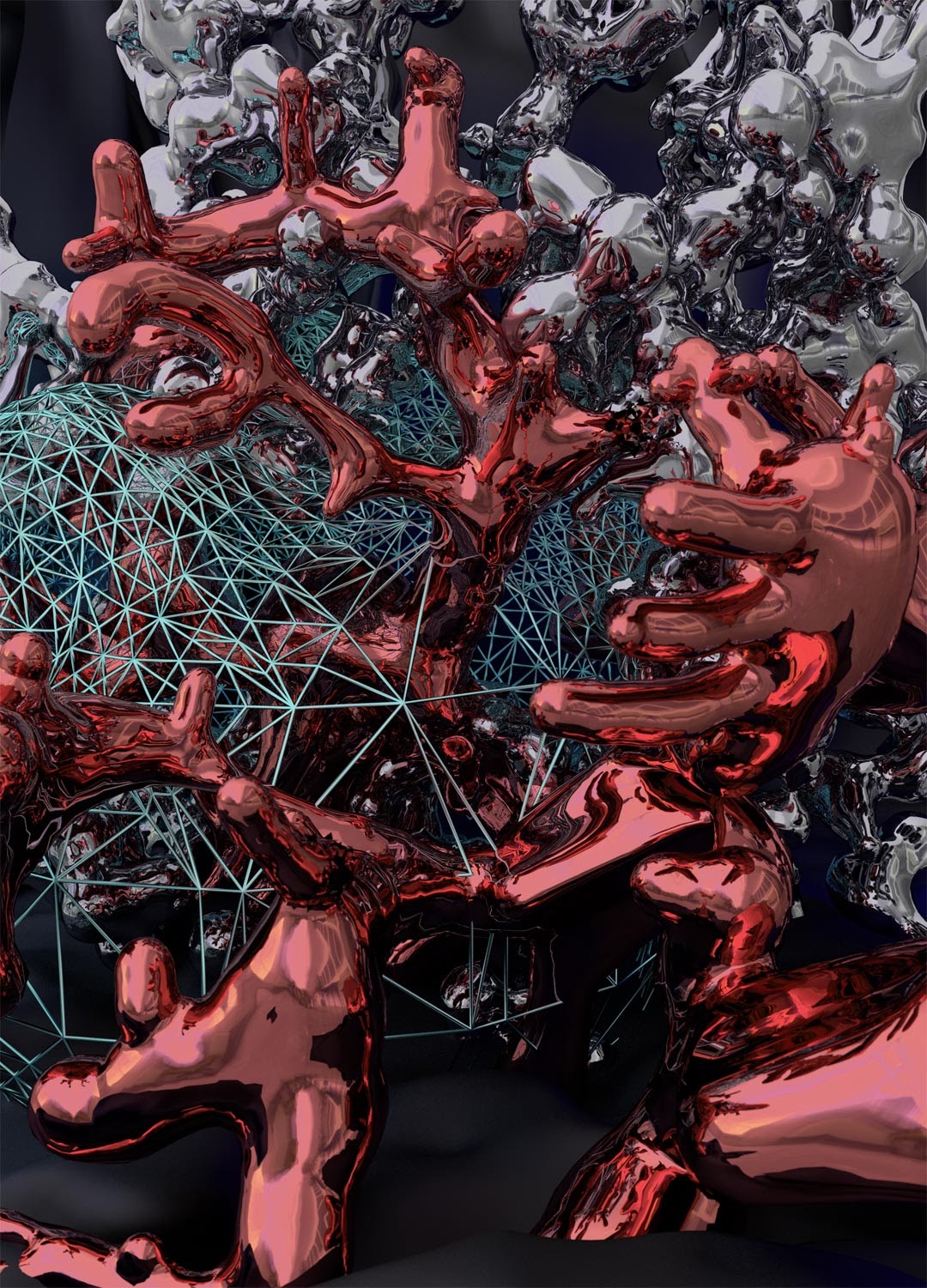
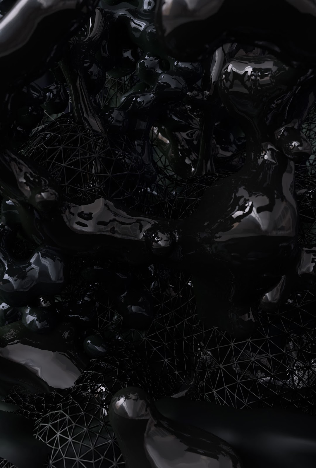
Here is a big update about Andreas Nicolas Fischer's work, which presents beautiful organic CGI made using several generative tools, specifically for the project into the post called Brute Forced Method he used a python script within Blender3d creating an endless series of 3d still-life compositions, which it then automatically publishes on his tumblr http://x.anf.nu.

Some of these weird viscous creatures and reflective textures remind me of the living ones created by Yoichiro Kawaguchi back in the late 80's, which were created thanks to his well known technique GROWTH Model, a model based on growth algorithm, and who has been highly inspired by sea creatures. See more;

Skynet, 2012

"Skynet is a non linear animation about a global networked consciousness. It plays with the idea how a single entity could the perceive the world – from a satellite to a microscopic view. 
Full sensory awareness encompassing the entire world is rolled into one artificial organism communicating with itself in realtime."


Engineered Viral Strain, 2012 - II, 2013


Brute Force Method, 2013

"There are no efficient algorithms for many computer science problems. The simplest approach is to try all possible (or many) solutions until the desired outcome is reached. This is called Brute Force Method. I created a Python script that creates arrangements of intersecting digital sculptures in front of a “frozen” cloth simulation, similar to a traditional still life, but with no physical constraints. The HDR image texture used to create the reflections on the genometry was taken at my studio, placing the virtual setup in the real world."


Brute Force Approach [Studies], 2013

Arrangement of digital sculptures in front of a “frozen” cloth simulation.


Brute Force Approach II, 2013


Rollin Leonard

$
0
0


Few days ago has taken place the closing of Trunks, Stems, & Heads solo show by Rollin Leonard at Transfer Gallery where he presented some new great pieces. The photographic work of Rollin is highly focused on human bodies which frequently is his own body and portraits the source to be manipulated and distorted. This time Rollin has also used several models to continue the mesmerising animated and static work in which for some pieces he has translated pixels into cells of plexiglas by installing and distorting the bodies cell by cell, this also reflects how manual is his  experimental work process, it doesn't matter if it's physical or digital Rollin animates and works everything manually creating somehow conscious glitches. See more;


"Trunks, Stems, & Heads is a new body of work from Rollin Leonard. The focus of his first solo exhibition is the human form – organs, limbs and torsos are strewn about, arranged into impossible creatures, disfigured through collision and installed as highly aestheticized, meticulously polished piles of digitally mutilated forms. The work is shiny and fleshy, and offers a new take on portraiture that captures the shifting perception of the physical self in our contemporary digital moment.

Human faces, bodies, and familiar objects are frequent subjects for the artist – he is interested in our innate ability to recognize the objects despite scrambling or distorting the image. A face, a subject with high visual elasticity, is especially resistant to being obscured or lost in pattern. Just as you see faces in wood grain, clouds, and shadows, your mind easily knits human form together even when fragmented.

The artist’s photographic practice serves as the basis for the work. After capturing his subjects at precise angles, Leonard manipulates their bodies into highly composed and calculated compositions of looped moving image, digital collage and plexiglass installation pieces." - Transfer Gallery


Yes / No, 2013
animated loop, photographic video application


360° / 18 Lilia, 2013
36 second Yes / No, 2013, animated loop, photographic video


Cell Body (Panty), (Stocking) and (Joe) 2013 
730 1 by 1, 702 1 by 1 and 838 1 by 1 inch pieces respectively 
c-print face-mounted to 1/2 inch cell-cast Plexiglas


Installation view at Transfer Gallery_


Crash Kiss (Guthrie & Ellis), 2013


Crash Kiss (Jorge & Giselle), 2013


Arm Ball (Rollin), 2013


Arm Ball (Lilia), 2013


Cell Face (Rollin), 2013
41 2 by 2 inch pieces, c-print face-mounted to 1/2 inch cell-cast Plexiglas


Belly Chain on a Donut- Shaped Universe, 2013


tile texture for the Donuts_


All jQuery effects by Sebastian Schmieg

Onion Skin by Olivier Ratsi

$
0
0


"Onion Skin is a new immersive installation by Olivier Ratsi, an artist on the AntiVJ visual label. The first stage in the Echolyse project, which will give birth to several variations around the same concept, Onion Skin is made up of a physical dimension - a module of two walls, positioned at right angles - augmented by a projection and a 5.1 sound broadcast. 

Onion Skin is a graphical work about the re-composition of time and space through a game of perspectives, both of the exhibition space itself and that of the projection canvas. Built around a progressive structure, made up of 4 parts lasting 14 minutes in total, the piece plays on the principle of repetition and scale to create a physical and hypnotic experience that opens doors onto the hidden and untouchable. 

The whole experience of the installation is based on a very specific point of view. A precise position from which a new dimension is revealed to the audience by anamorphosis. The simple geometric elements ("peelings") that seemed to be flat at first suddenly start delimiting a new space. The illusion of a new dimension within the installation slowly appears as the onion skins seem to be leaving their physical surface behind." - AntiVJ. See more;


Enda O'Donoghue

$
0
0


Glad to see a great update of Enda O'Donoghue's work, which continues capturing through oil paintings the glitched random photographs he finds on the internet featuring different kind of errors. If you didn't know about his precise work, I recommend to read and interview we did 3 years ago about his process painting and more, see here.

Enda O'Donoghue opens today a new solo show at Klettgau Galerie which will be running till next 9 March 2014. See more;


Some of the paintings below also have been made using acrylic and oil paints, to see more information, titles, dimensions and large details of each painting featured here, check out his website.


DAYDREAM by NONOTAK STUDIO

$
0
0


"DAYDREAM by Nonotak Studio is an audiovisual installation that generates space distortions. Relationship between space and time, accelerations, contractions, shifts and metamorphosis have been the lexical field of the project. This installation aimed at establishing a physical connection between the virtual space and the real space, blurring the limits and submerging the audience into a short detachment from reality. Lights generate abstract spaces while sounds define the echoes of virtual spaces. Daydream is an invitation to contemplation. The frontality of the installation leads the visitors to a passive position."

This project reminds me of some other installations by Kit Webster who also has been exploring projected light and visuals through space using different layers of geometric structures. But there is something fascinating in DAYDREAM too, I like the interactivity with the user and the light and the feedback the shadow leaves on the layers behind of, it remind me of the feeling while performing with video feedback, of course here there's not delay but there is also an interesting project called X-RAY TRAIN by Shimurabros where they got delay projecting over a frontal layered straight structure, have a look here. See more;


Viewing all 185 articles
Browse latest View live