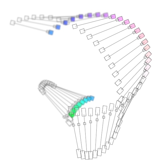
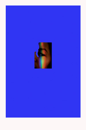
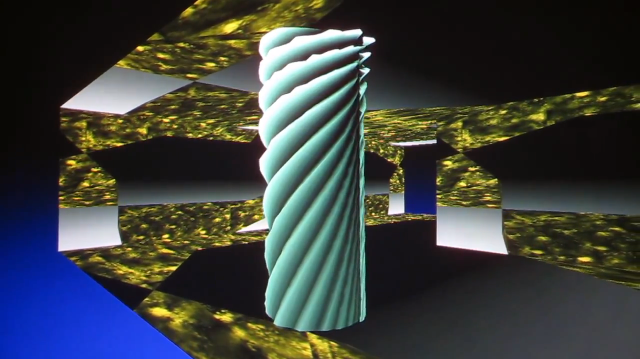
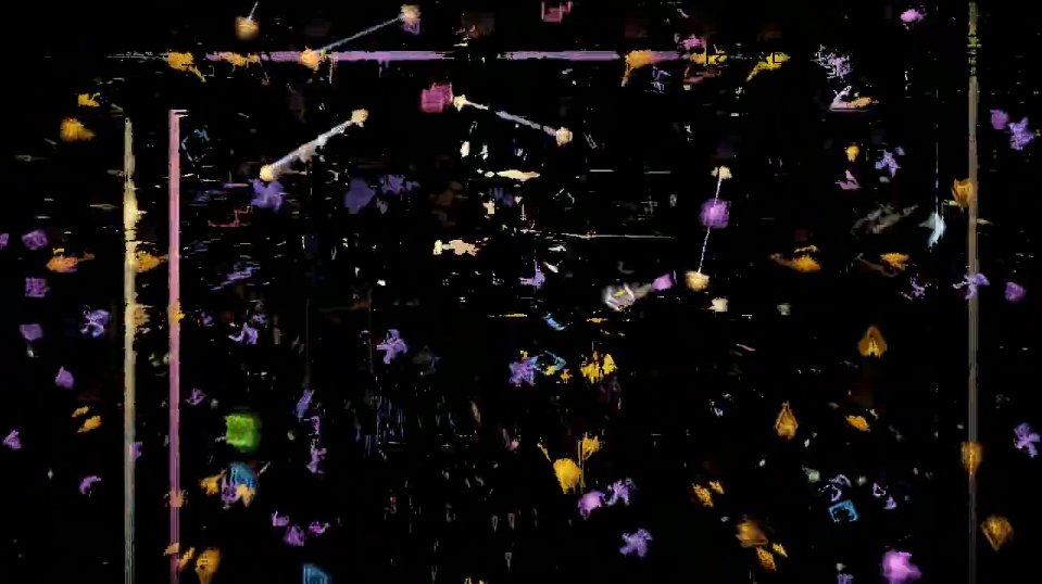
Colorful Colorado Revisited, 2013, is a new great work by Yoshi Sodeoka. The piece it's a a remix of "Colorful Colorado (1974)" by video pioneer Phil Morton. It was made for REMIX-IT-RIGHT: Rediscoveries in the Phil Morton Archive, commissioned by Jon Cates. See more;
↧
Colorful Colorado Revisited by Yoshi Sodeoka
↧
cyclo.id
"Ryoji Ikeda and Carsten Nicolai both work at the cutting-edge of contemporary electronic music and sound art. In 1999, the two artists initiated the joint project cyclo., which is devoted to the visualization of sound. In their shared work, they generate new hybrid forms of audiovisual art and expand the possibilities of digital technology.
The project's first publication is cyclo.id, a book and included CD-ROM that offer a multimedia and interactive documentation of the audiovisual material that Nicolai and Ikeda have collected, researched, and created since they began working together. The featured images are formed by the metering of sound bits that have been selected by the artists with meticulous care according to their acoustic and illustrative potential." - Gestalten. See more;
It's posible to buy cyclo.id at Gestalten
Images from the book courtesy Gestalten, click on them to enlarge.
This is a nice video/talk where Carsten Nicolai speak about his work and about another previous good book he made while ago, called Grid Index, the first comprehensive visual lexicon of patterns and grid systems.
↧
↧
I'm Google by Dina Kelberman
Impressive research based works by Dina Kelberman. Im featuring one of her ongoing projects called "I'm Google" which presents a great organized image and video research by many different factors. But I highly recommend to check out also her other similar ongoing projects featuring a huge variety of imagery source such as found image, photographs, cartoons.. like the one at her start page called "smoke and fire" also presented at the New Museum as online exhibition.
"My work comes out of my natural tendency to spend long hours collecting and organizing imagery from the internet, television, and other commonplace surroundings of my everyday life. I make things as I am compelled to make them and consider why later, often making connections I didn’t consciously set out to realize. I gravitate towards things that are simple, colorful, industrial, and mundane. I am also interested in using materials that are easily accessible and familiar to the everyday person. My work elevates the familiar and transforms brief moments into infinite stretches of time. In close examination of the simple or the seemingly insignificant the viewer may bring their own limitless associations." - Dina Kelberman. See more;
I'm Google
"I’m Google is an ongoing tumblr blog in which batches of images and videos that I cull from the internet are compiled into a long stream-of-consciousness. The batches move seamlessly from one subject to the next based on similarities in form, composition, color, and theme. This results visually in a colorful grid that slowly changes as the viewer scrolls through it. Images of houses being demolished transition into images of buildings on fire, to forest fires, to billowing smoke, to geysers, to bursting fire hydrants, to fire hoses, to spools of thread. The site is constantly updated week after week, batch by batch, sometimes in bursts, sometimes very slowly.
The blog came out of my natural tendency to spend long hours obsessing over Google Image searches, collecting photos I found beautiful and storing them by theme. Often the images that interest me are of industrial or municipal materials or everyday photo snapshots. I do not select images or videos that appear to be intentionally artistic. Happily, the process of researching various themes in this way has lead to unintentionally learning about topics I might never have otherwise, including structural drying, bale feeders, B2P, VAWTs, screw turbines, the cleveland pack, and powder coating.
I feel that my experience wandering through Google Image Search and YouTube hunting for obscure information and encountering unexpected results is a very common one. My blog serves as a visual representation of this phenomenon. This ability to endlessly drift from one topic to the next is the inherently fascinating quality that makes the internet so amazing." - Dina Kelberman.
--/--
--/--
--/--
--/--
--/--
↧
Borna Sammak
"Borna Sammak collects and manipulates videos primarily by deleting colors of the composition that don’t relate to him as much as others that do. This is why most of Borna’s videos are so recognizable, his color palette is unique to his taste—the same taste that guides him through the web or influences any choice for that matter. The deconstructed images weave in and out of one another so that there is no longer an image above nor an image below but instead a sort of hermetic structure flowing within itself. Flowing but at the same time not entirely changing any more than an eye follows the compostion of a static image.
Borna’s main inspiration however isn’t the shit content he finds online. Instead he is inspired mostly by camouflage—which is evident in the patterns he constructs—a pattern, as a native Philadelphian, he first encountered on cargo shorts." - Jasmin Tsou at Vox Populi Gallery. See more;
Gray Water, 2013
Untitled Video Painting 07, 2009
Untitled Video Painting 05, 2009
Untitled Video Painting 02, 2009
↧
W-H-A-T-E-V-E-R.NET by Emilie Gervais
w-h-a-t-e-v-e-r.net is a project created by Emilie Gervais working through a simple but great concept, consisting in a website where you can upload your HTML pages as girl or boy art. A gendered HTML collection which was launched last week and there are already some interesting pieces from both sides, you can see some of them into the post. It seems the boys are being a bit more participative so far.
So you can upload whatever you want as whatever you are but you should know that the website only upload the HTML file and doesn't host any other file from the HTML, such as images, videos.. if it's the case make sure you use online source. See more;
Some HTML pages uploaded at w-h-a-t-e-v-e-r.net
Girl art http://w-h-a-t-e-v-e-r.net/girl/girlieart.html
Boy art http://w-h-a-t-e-v-e-r.net/boy/dhrubo.html
Girl art http://w-h-a-t-e-v-e-r.net/girl/naomi2.html
Boy art http://w-h-a-t-e-v-e-r.net/boy/pixels.html
Boy art http://w-h-a-t-e-v-e-r.net/boy/SUPERCAMELTOE.html
↧
↧
Interior Landscape by Carol Inez Charney
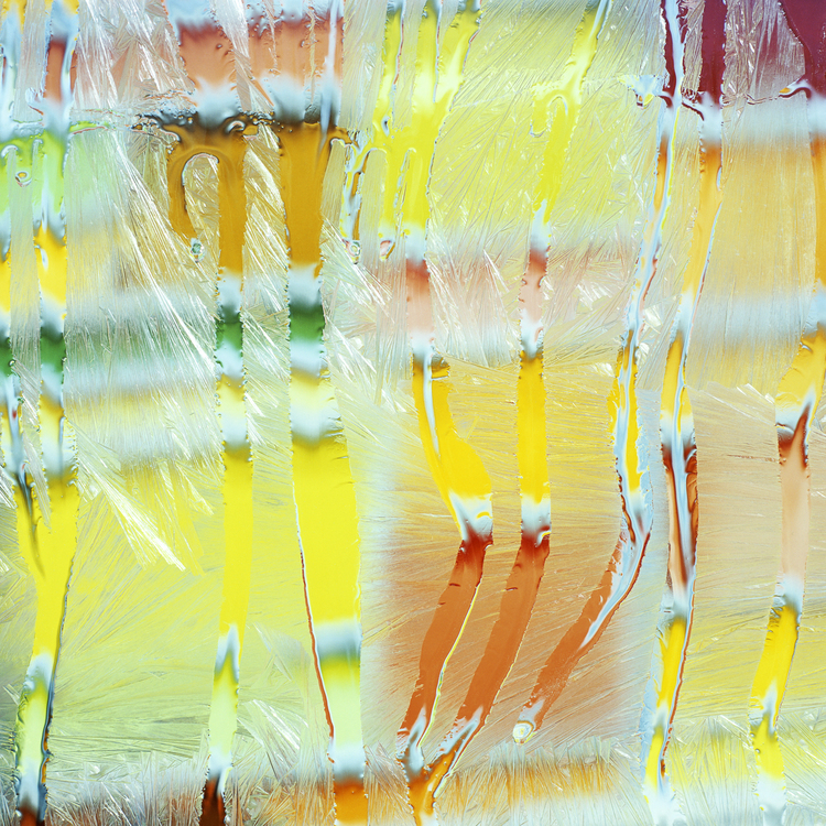
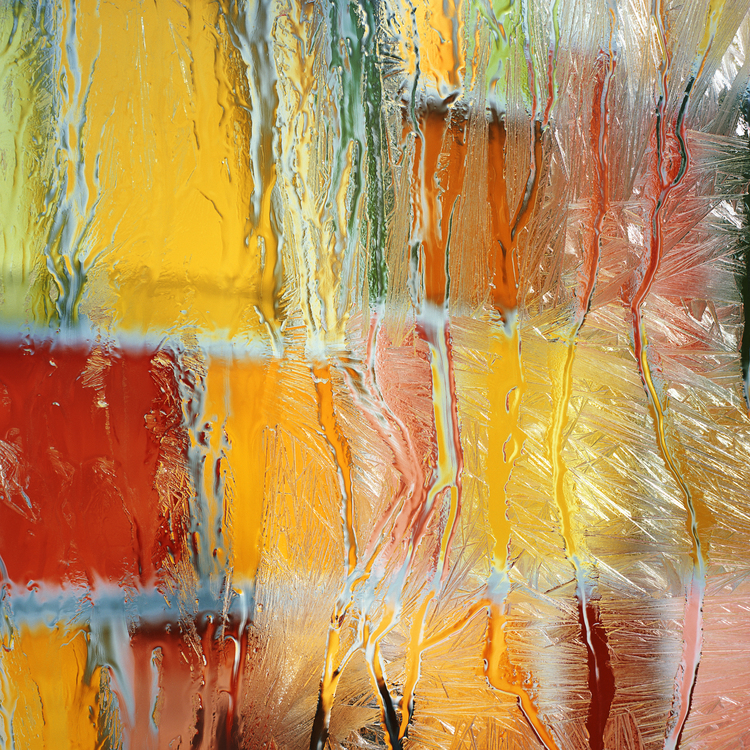
Interior Landscape, photograph series by Carol Inez Charney_
"My current photographic series, Interior Landscape, uses natural distortions present in our everyday world—namely, moisture on windows—to evoke a painterly image that recontextualizes our everyday architectural landscape. While focusing on the minute details of these natural distortions, we enter a space of quiet contemplation, which simultaneously inspires a new kind of internal and external vision." - Carol Inez Charney. See more;
"I'm interested in how different materials such as water and more recently ice—create their own types of abstractions. In addition, in my process I'm systematically exploring shifting points of view within the architectural grid to create compositional studies that are more commonly found in painting rather than in photography." - Carol Inez Charney.
↧
Matthew Brandt
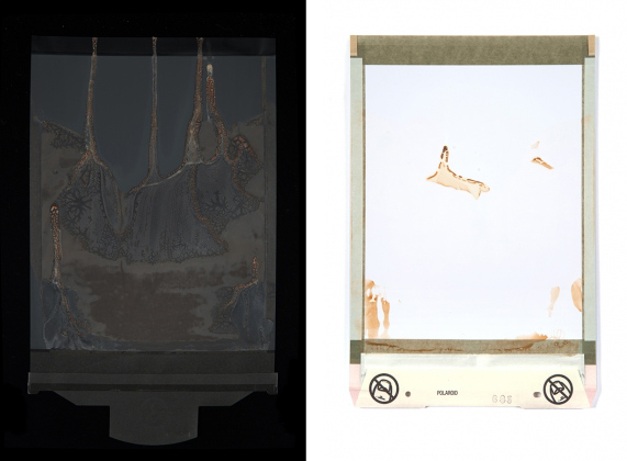
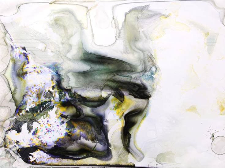
Next April 4 Highlight Gallery will present Water & Polaroid, a solo exhibition by Matthew Brandt until next May 18, 2013. Into the post you can also find Lakes and Reservoirs, a previous series from 2011 which follows the same experimental process in connection with water from lakes.
"For Water & Polaroid, Matthew Brandt presents three bodies of work based on the manipulation of photographic emulsion. To create the works in the exhibition that involve Water, inspired by early landscape photography of the American West, Brandt incorporates the subject of the image into its manipulation. At its most elaborate, Brandt’s process involves using water from an actual waterfall he has photographed to rig an artificial waterfall that pours over the printed image, creating streaks of color that drip from the emulsion. At its most direct, he soaks prints in water drawn from their subject lakes.
Nymph Lake, one piece from Brandt’s Lakes and Reservoirs series, demonstrates this process. Out in the field, Brandt takes with him two key tools: a camera and a five-gallon plastic jug. “The camera is to take an image of the lake or reservoir, while the jugs are to take some of the actual lake,” he explains. Upon return to his studio, Brandt prints selected images, then empties the collected water into a large tray and submerges the C-print of the lake directly into itself. Finally, he waits, as the water in the image slowly breaks down the image itself over the course days, weeks, or even months." - Highlight Gallery. See more;
"In contrast to the external manipulations in his Water series, Brandt’s Polaroids explore the material of the photograph’s own substrate. By distressing the chemical emulsion of the Polaroid and manipulating the development process by hand, Brandt creates vertical color reliefs that mimic the structure of a waterfall in their flowing movement.
To complete the exhibition, Brandt will present for the first time a new body of work titled Water Falls, a series of light boxes that emphasize the extensive range of properties attainable through manipulated emulsion. For Mystic Falls, Brandt prints four separate color duraclear transparencies in cyan, magenta, yellow and black (cmyk), then subjects them to degradation in their own water for up to four weeks at a time. Using his artificial waterfall mechanism to interject the traditional cmyk colored layering process, Brandt creates a range of tonalities across multiple impressions of a single image of Mystic Falls, and then illuminates their every detail." - Highlight Gallery.
Water & Polaroid
Lakes and Reservoirs, 2011
↧
Manfred Mohr
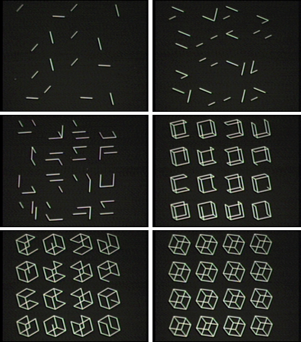
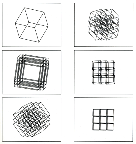
Here are some amazing experiments made by Mandred Mohr back in 1973. He was invited by the CEO of La Companie Generale de Micromatique (a data storage and preservation company, which specialized in micro films) to experiment on their brand new machine DATAGRAPHIX 4460 to make computer animations. Along 4 years Mandred Mohr created these great studies geometric forms despite the process of was extremely slow at that time. See more;
Update: there's an interesting interview with Manfred Mohr at The White Review, where Manfred talks about the beginning of his carrier, earliest computer drawings and animations and also how difficult was for people to understand (his) computer based works as art in the 70's. See here. (thanks for the tip Lawrence Lek)
Cubic Limit, 1973-1974
"A single large cube, with solid edges, rotates in 3-D. As it rotates, it slowly breaks up into 25 embedded cubes each starting at the same center point but moving slowly towards their positions on a 5x5 grid. At the same rate, they are shrinking in size so that they fit onto the 5x5 grid as non-overlapping cubes.." more info about Cubic Limit here.
Square Roots, 1972-1973
"The earlier 16mm film (around 4 min), 'Square Roots' (1972-1973), was my first attempt to make a computer movie. I abandoned this short film because I felt it was too narrative. Subsequently I made the more abstract film 'Cubic Limit' (above). Nevertheless, although unedited, this is a short amusing film which has some of the 2-D elements which I later used in 'Cubic Limit' in 3-D."
Transformation I, 1972-1973
"This short 16mm film (around 1 1/2 minutes) is 'Transition I' (1972-1973). As an inauguration gift, I transformed a sketch of the new city hall into the coat of arms of my hometown Pforzheim. Images from this film are published in the book: Pforzheim 1973"
Transformation Study, 1972
"This very short footage (around 1/2 minute) from 1972 is a study of a cube transforming to random points and back."
Complimentary Cubes, 1973-1974
via | VIDEO CIRCUITS
↧
LAb [au]
m0za1que and Particle synthesis, two projects by LAb [au]
"m0za1que is a permanent artwork for ‘La Maison Mécatronique’ in Annecy-Le-Vieux, France. The main wall of the entrance hall 3.4m x 6m is divided in 26x15 squares. Each of the 390 tiles is motorised by a linear actuator with a range of 10cm. The individual control of the motion creates different three-dimensional reliefs of geometric patterns evolving following the logics of cellular automata.
During day these programmed motifs draw black shadows whereas in the evening they draw coloured shadows: The illumination by three light-projectors in primary colours of red, green, and blue leads to a global white illumination of the wall but the tiles’ shadows appear in the secondary colours of light. These coloured surfaces appear and disappear according to the tiles’ movement.The artwork relates motion with colour through the phenomena of light; while it’s mechanic and electronic system is exemplary for the very function of the building." See more;
m0za1que, 2012
Video here.
"The resulting mosaic can be compared to the electro-magnetic functioning of a memory slot in computation logics. The-so called 'place holder', having here the size of the matrix of tiles, can be filled with binary data and where this magnetic action leads in the installation also to physical motion. Information emerges not only out of the binary state but out of the relative position of the tile in the matrix. What in terms of computer logics is referred to as sequential data becomes here spatial data.
When no data activates a tile, the rigorous absolutely white surface is nothing but emptiness: zero is flat and white or pure light. When tiles are activated shadows outline their sharp-edged square shape, one is dark or no light. This transposition of the operating modes of the installation to the binary logic of computer memory is the origin of the project name 'm0za1que'. In this manner the installation gives the inherent computation logics a proper esthetic both on the level of its physical realisation and on its kinetic behavior." - LAb [au]
Particle synthesis, 2011
Video here.
"The project ‘particle synthesis’ started from the idea of combining 3D particle engines with granular sound synthesis, a research mainly motivated by the possible convergence of visual, sonic and spatial parameters processed in real time within electronic space. Both technologies are considering a shape, a form or a sound as the result of many combined elementary particles which would be individually neither visible nor audible. In computer graphics the tiny graphic elements are named ‘particles’ whereas in granular synthesis many names exist for the sonic ones such as ‘sonel’, ‘sonic quanta’... The very broad notion of particle as it can be applied to sonic and visual elements has been retained for the project name as ‘synthesis’ in reference to the way sound is processed.
The hexagonal shape of the installation translates these sonic and spatial specificities: six networked computers, each rendering 60 degrees of the 3d scene, are boxed in a transparent Plexiglas case also including a speaker. These boxes have the shape of a stage monitor and are placed next to each other on the ground to constitute the hexagonal ring. The speakers and screens are oriented towards the center of the installation offering the visitor inside the ring an immersive and ‘spatialised’ experience whereas the ‘external’ view rather gives a complete vision, an overview, of the setting. This principle is also present in the design of the hardware, from outside the spectator see through the transparent box the ‘stripped’ electronics whereas from the inside only the screen image remains visible. In this manner the specific shape and design of the installation initializes the viewer to the project specific spatial, sonic and technological setting and invites him to enter the installation. Once the spectator has taken the engagement to enter the installation he takes part of the visual and sonic space and as such the spectators’ ‘act’ shifts the statue of the installation from an object (external perception) to a space (internal perception)." - LAb [au]
↧
↧
Jordan Belson 5 Essential Films
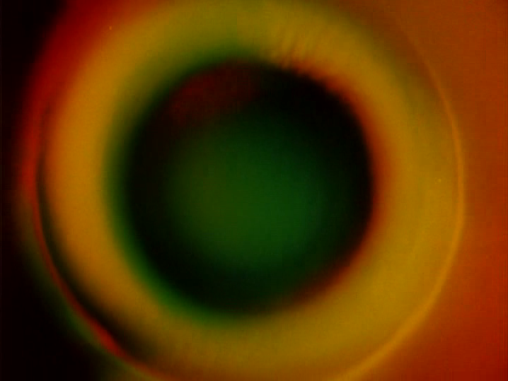
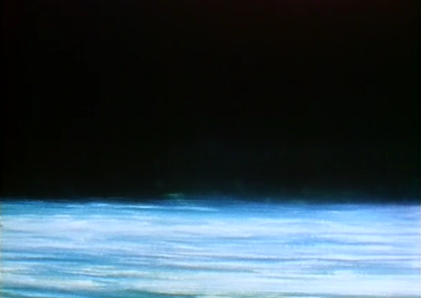
Jordan Belson 5 Essential Films is another film I rented while ago which features 5 amazing works by filmmaker and artist Jordan Belson who created spiritually oriented abstract films richly woven with cosmological imagery, exploring consciousness, transcendence, and the nature of light itself. See more;
Here are some still images from each piece. This is a great film to have, which is on several sites online around 25-30€.
Information courtesy Centerforvisualmusi.org where you will find more about Jordan Belson and this DVD.
Allures (1961)
"An early (8 min) masterpiece of Non-Objective Cinema “I think of Allures as a combination of molecular structures and astronomical events mixed with subconscious and subjective phenomena – all happening simultaneously. the beginning is almost purely sensual, the end perhaps totally nonmaterial. It seems to move from matter to spirit in some way.” “…it took a year and a half to make, pieced together in thousands of different ways….Allures actually developed out of images I was working with in the Vortex Concerts.” (Jordan Belson, quoted in Expanded Cinema by Gene Youngblood, p. 160-162). The soundtrack is a collaboration with Henry Jacobs. Allures was preserved with the support of the National Film Preservation Foundation."
Samadhi (1967)
"Samadhi (6 min) evokes the ecstatic state achieved by the meditator where individual consciousness merges with the Universal. “I hoped that somehow the film could actually provide a taste of what the real experience of samadhi might be like.” (from Scott MacDonald’s interview with Belson in A Critical Cinema 3). Belson adds “It is primarily an abstract cinematic work of art inspired by Yoga and Buddhism. Not a description or explanation of Samadhi.”
Light (1973)
"Light (8 min) is based on the continuity of the electromagnetic spectrum. It is a ride through space and light. This is the last film for which Belson composed his own soundtrack."
Fountain of Dreams (1984)
Epilogue (2005)
"By way of pure Visual Music experience, the Hirshhorn Museum (Smithsonian Institution) commissioned a major new work from abstract film artist Jordan Belson, who distilled 60 years of visionary sound and images into a twelve minute videofilm, synchronised to a symphonic tone poem “Isle of the Dead” by the great lyric composer Sergei Rachmaninoff."
↧
Simon Katan
Simon Katan combines electronic music, live animation, interaction, and social gaming to make software which creates musical odysseys through exploring animated worlds. In the following works into the post you can see how interesting and playful is the interaction while composing the music and the multiple different ways Simon creates to compose it through minimalist interfaces. See more;
Cube with Magic Ribbons, 2012
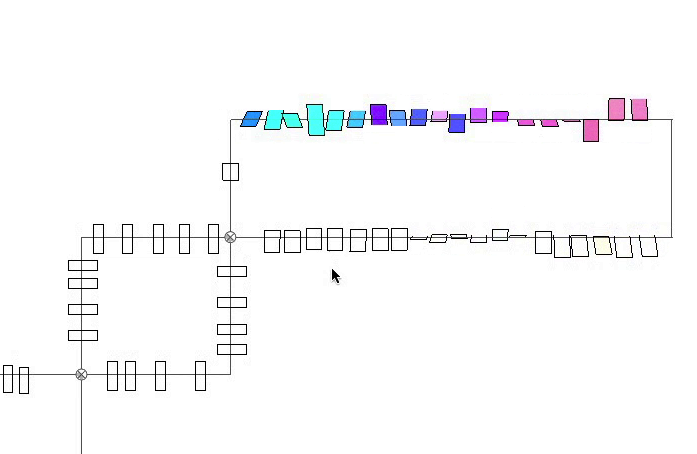
"Cube with Magic Ribbons is a computer visual and synthesised sound composition for live performance. The piece takes its title from a drawing of M.C.Escher which is rich with contradictory perspectives but it is also inspired by the wrapped spaces found in the two dimensional graphics of early computer games such as Asteroids and Pac-Man. It was created using a custom visual sequencer SoundCircuit, which rather than employing a conventional DAW layout, allows multiple virtual tape-heads to travel through a two-dimensional wrapped space along tracks that can be freely inter-connected. As the tape-heads travel through the resultant network, the topological layout of the tracks comes to directly influence the macro form of the music. Furthermore, as the piece unfolds the nature of this already confusing space reveals itself to be increasingly elastic and complex, yet inexorably intertwined with the musical form." - Simon Katan
What Is Life ?, 2012
"What Is Life ? is a computer visual and synthesised sound composition for live performance. The piece uses a custom visual sequencer called SoundLens which comprises an OpenFrameworks visual interface and an OSC controlled SuperCollider patch. These combine to imply an analogue between a simulated visual focal effect, reminiscent of a camera lens or microscope, and auditory depth of field. Into this world are placed multiple copies of a sound producing mechanical object.
Inspired by a coincidental similarity between certain arrangements of these objects and the double helix structure of DNA, the piece takes its title from the name of Erwin Schrödinger’s book in which he develops the concept of a complex molecule with the genetic code for living organisms. Nevertheless, there is a deeper connection between title and piece in that it progresses solely through the copying and mutation of its own material." - Simon Katan
God Over Djinn, 2011
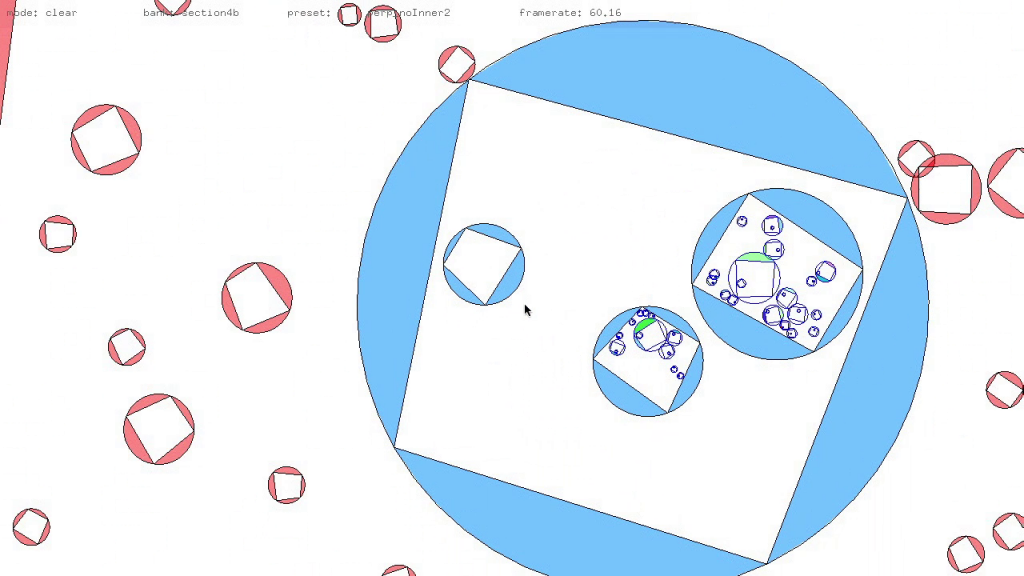
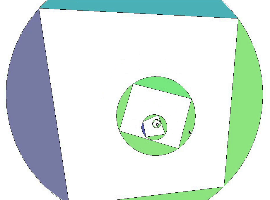
"God Over Djinn is a piece for live animation and synthesised sound composition that draws on our intuitive understanding of the physical world, as well as playing with ambiguities between scale and perspective in two-dimensional representation to create seemingly infinitely nested worlds of colliding objects.
The work was inspired by impossible worlds of M.C.Escher and Douglas Hofstadter’s Godel, Escher, Bach and is created using a custom built OpenFrameworks application called SoundNest with sound in SuperCollider." - Simon Katan
↧
Anita Ackermann
Some interesting works by Anita Ackermann who uses light and sound as major source for her work and studies. Also Anita made some great concepts playing the perspective using mirros at her series Reflectionen. See more;
Painted by the light
Light tudies II
In the light of perception
↧
Spheres 1-20 by Sara Ludy
Last month Sara Ludy had her first solo show in New York at Klaus Gallery, where she presented a 20 min single channel video work titled "Spheres 1-20" which was projected on the gallery wall featuring a rotating fly-through of 3D-generated environments comprised of twenty episodes on a loop.
As Klaus Gallery describes the process of; these “Spheres” are rendered digitally, then projected onto colored paper in Ludy’s studio and recaptured with a digital camera. The resulting high/low-fi picture quality mediates between the virtual and the physical spaces in which the artist works. See more;
"In Spheres 1-20, ambiguous forms float in polygonal landscapes created from snippets sourced from Ludy’s wanderings of the internet, personal photos, and samples of computer-aided-drafting motifs. Taking two-dimensional screen captures and image-mapping them onto three-dimensional rotating forms, Ludy creates her Spheres as virtual architectures that refer to an amorphous and psychological space. Between each 1-minute episode of the video, abrupt cuts shift the focus to new structures while an audible synthesized drone changes pitch with each reveal, similar to the shift found between levels in video gameplay." - Klaus Gallery
↧
↧
One Good Emperor by Ben Alun-Jones
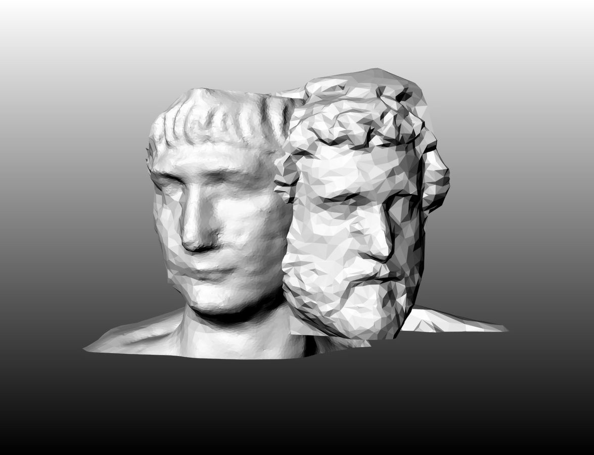
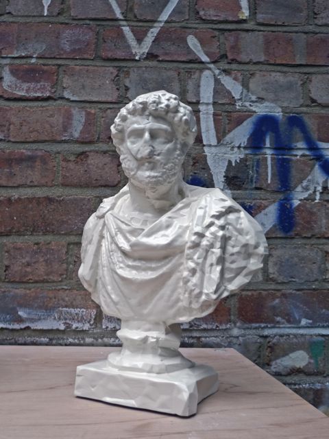
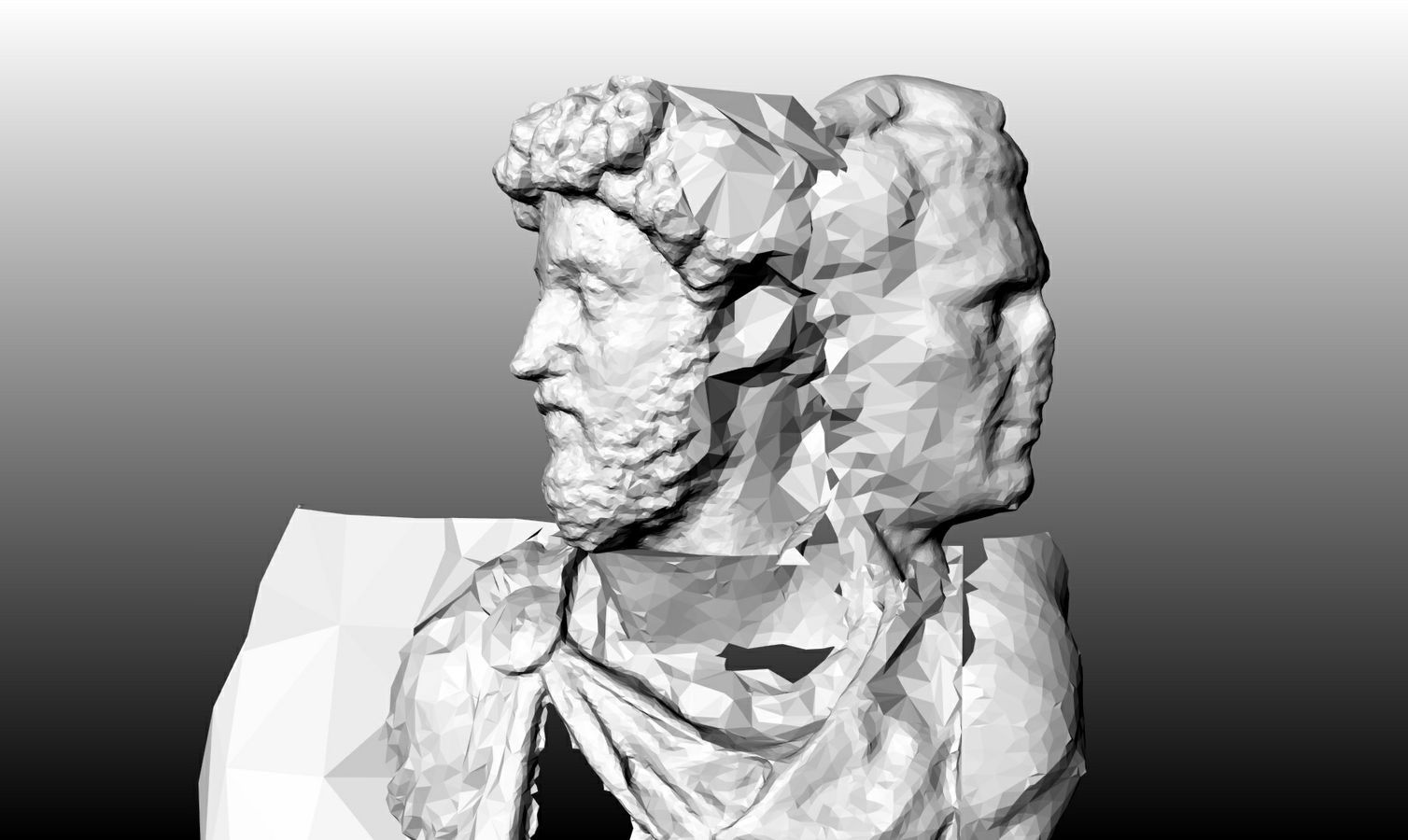
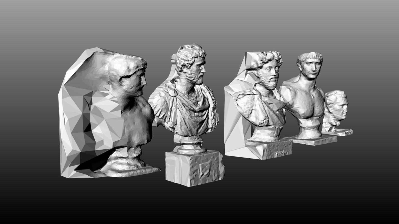
"There were ‘Five Good Emperors’ of ancient Rome - Nerva, Trajan, Hadrian, Antoninus Pius and Marcus Aurelius. These five men were the most successful of their kind. ‘One Good Emperor’ asks if by mixing and blending their best attributes can we find the greatest Emperor of the Roman Empire?
Using his 3D scanning and remixing tools, Ben Alun-Jones has scanned the busts of these five emperors from the British Museum in London. These scans have then been blended to create different mixes of One Good Emperor. Several attempts to find the perfect mix will be shown and reproduced physically. Many of these classical busts were also reproductions and so the idea of the original can often be distorted. This project questions the notions of value and uniqueness in a world where any object can be scanned, sampled and reproduced, simply by recording the object on video." - the Works Collective. See more;
This work has been recently shown in Ventura Lambrate Milan as part of the Works Collective.
↧
this is not a place by Michael Manning
Love this piece by Michael Manning, made for The Eternal Internet Brotherhood 2013. See the work and interact with here.
↧
Flowpi
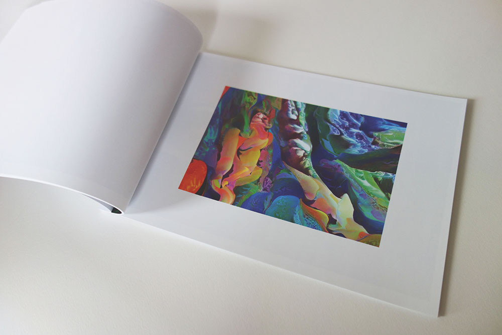
Can't wait to receive this limited printed publication (100 copies) featuring the great algorithmic work by Jonathan McCabe, who has worked with Bryce Wilner to make together this piece called Flowpi, which title makes reference to a combination of a "flow" and a pattern forming system named after the pomacanthus imperator fish. The book contains thirty-one new compositions by Jonathan McCabe. To see more info and how this generative and organic texture really flows check out this previous post about Flowpi. See more;
The book's pages were printed by Sunrise Digital on Indigo Text 80# paper. It's available in paperback only, it costs 20$ and it's possible to buy it here.
↧
Yoichiro Kawaguchi
Some great computer animated works I hadn't seen yet from Yoichiro Kawaguchi using his unique style through his "GROWTH Model", a model based on growth algorithm, a self-organizing method to give form to one's rich imagination or to develop one's formative algorithm of a complex life form. See more info about Yoichiro Kawaguchi and his work process on this previous post. See more;
Origin, 1985
Embryo, 1988
Flora, 1989
Composed by Tod Machover, computer graphics by Yoichiro Kawaguchi. Based on the voice of Karol Bennett.
Cytolon, 2002
↧
↧
Nicolas Boillot
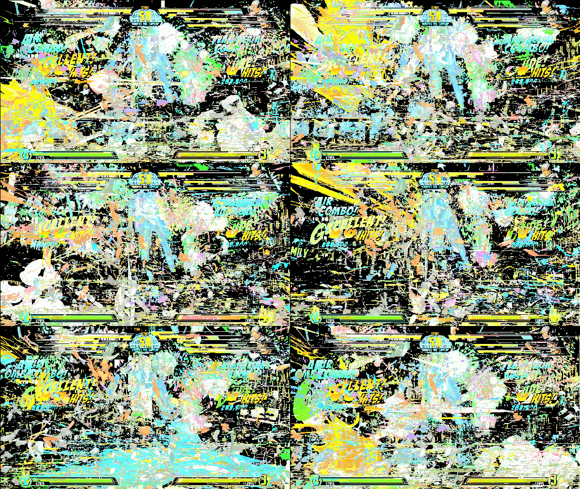
Loops of Marvel vs Capcom , 2013
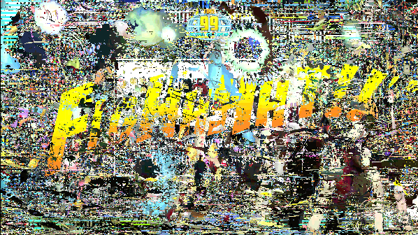
Nicolas Boillot is highly inspired and uses as a main visual source several video games to create his abstract and chaotic loop animations. From the two animated pieces here in the post, the gif above "Loops of Marvel vs Capcom" and the video into the post "Geometry Wars", Nicolas Boillot extract and accumulate only the moving parts, on a loop of 25 images/frames. As he told us; he tries to gather, by this process, a selection of what our eyes undergo when we play the video games. Movements are like "a candy" for our eyes and brain, and by these accumulation, confrontation, he tries to unveil in an empirical way what game designer conceives to keep us hooked. See more;
You can see more of his mesmerizing animated loops working through gif in this previous post and check out more of his loops at this ongoing series, here.
Fighhhht !!, 2013
Geometry Wars, 2012
↧
ホワイトホール Toshio Matsumoto
↧
What we call sculpture at CERMÂ
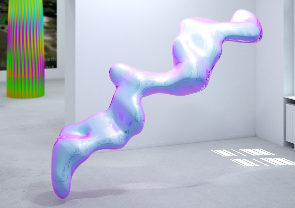
Ecstasy rmx by Francoise Gamma
CERMÂ presents a new exhibition titled What we call sculpture which focuses on the possibilities of sculpture through the use of digital tools in the context of Internet and the exhibition possibilities of the online medium. It features works by Chris Timms, Francoise Gamma, Kareem Lofty and Manuel Fernandez. Check it out through the interactive and virtual walkthrough, here.
"Since the advent of video games and the Internet, the notion of actual physical space has been complemented by the existence of virtual spaces, built using code and 3D software where graphics you can see on the screen not only occupy a physical space as storage on a hard disk, but through contemplation or interaction with simulated spaces we can perceive aspects as size, material and volume, all typical of traditional sculpture.
From Mario Bros for Nintendo 64 in the entertainment industry, through social networks like Second Life, to come up with new ways in which we perceive the real world using simulators such as Google Earth, the products generated by 3D software tools have changed dramatically shaped the way we relate and understand the real space, so much so, that an architect can now recognize the version of AutoCad with which a building is designed.
What we call sculpture is a collection of works that use sculpture procedures, installation, intervention, etc. as a means of digital experimentation to develop artistic strategies online." - CERMÂ. See more;
New Ruins by Manuel Fernandez
Manuel presents New Ruins. Google Earth Tour, a site specific installation with two parts: A greec doric column model extracted from a 3D Parthenon model, emapped and installated in the 3D gallery scale space from the ceiling to the floor. And the second part it's New Ruins. Google Earth Tour, a screencapture video documenting the remapping geolocated installations’s project made in Google Earth, in wich the most known ancient ruin models have been remapped and installated in their original places.
Sensual Objects by Chris Timms
Sensual objects originated as looped .gifs relating to the sensual space of experience, typically attributed to physical presence.
Hummel head by Kareem Lotfy
Ecstasy rmx by Francoise Gamma
Francoise Gamma presents Ecstasy rmx a digital animated 3D sculpture, inspired by the saturnian night, the medieval poetry and fractals in the social networks.
Exhibition map_
↧