Quantcast
Channel: TRIANGULATION
Viewing all 185 articles
Browse latest View live

Optical Calibration Targets

$
0
0


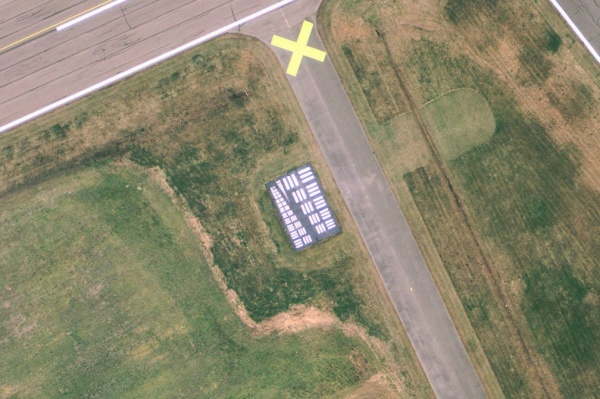
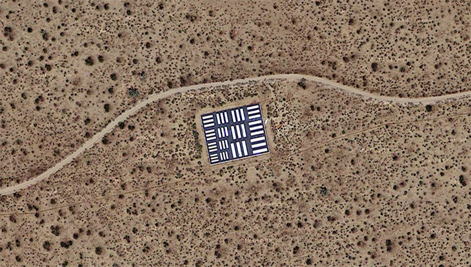
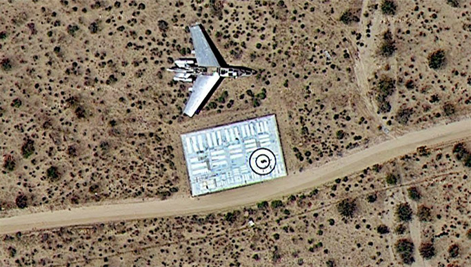
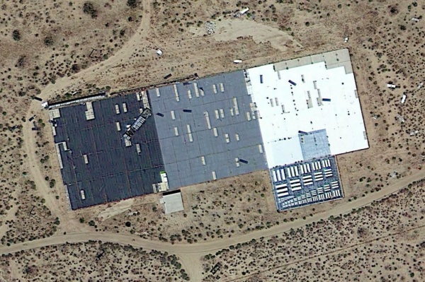
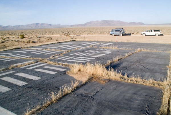
This is something really interesting I hadn't thought about before, about how to test, calibrate, and focus aerial cameras traveling at different speeds and altitudes. The are some optical calibration targets built as platforms across the USA which construction and geometrical composition in contrast with different fields looks also beautiful. There is a good post about at BLDGBLOG which intro says; "There are dozens of aerial photo calibration targets across the USA," the Center for Land Use Interpretation reports, "curious land-based two-dimensional optical artifacts used for the development of aerial photography and aircraft. They were made mostly in the 1950s and 1960s, though some apparently later than that, and many are still in use, though their history is obscure."

These symbols—like I-Ching trigrams for machines—are used as "a platform to test, calibrate, and focus aerial cameras traveling at different speeds and altitudes," CLUI explains, similar to "an eye chart at the optometrist, where the smallest group of bars that can be resolved marks the limit of the resolution for the optical instrument that is being used." See more;

"Formally speaking, the targets could be compared to mis-painted concrete parking lots in the middle of the nowhere, using "sets of parallel and perpendicular bars duplicated at 15 or so different sizes." This "configuration is sometimes referred to as a 5:1 aspect Tri-bar Array, and follows a similar relative scale as a common resolution test chart known as the 1951 USAF Resolving Power Test Target, conforming to milspec MIL-STD-150A. This test pattern is still widely used to determine the resolving power of microscopes, telescopes, cameras, and scanners."

The images are screenshots taken from Google Earth and Google Maps.
Read more about at BLDGBLOG


Takagi Masakatsu

$
0
0


Not sure when Takagi Masakatsu relaunched his website, the thing is that the new site shows now a lot of stills from many of his great video works with a pretty nice resolution where is possible to appreciate the texture and forms of his creations over video such as in the still above which is from a piece called Anyura, 2011, very impressive. See more;

Check out a previous post showing some videos of Takagi Masakatsu here.
The texture and colors from Wave are awesome too, see here.


Ymene: 1. idu mi, 2010


Earth's Creation #1, 2010


Toner, 2006


Philharmony, 2007


The color of empty sky, 2005


Mitch Trale

$
0
0

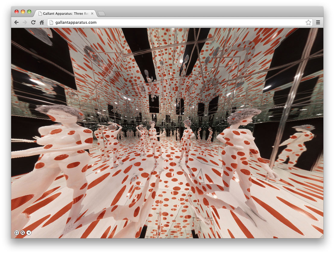
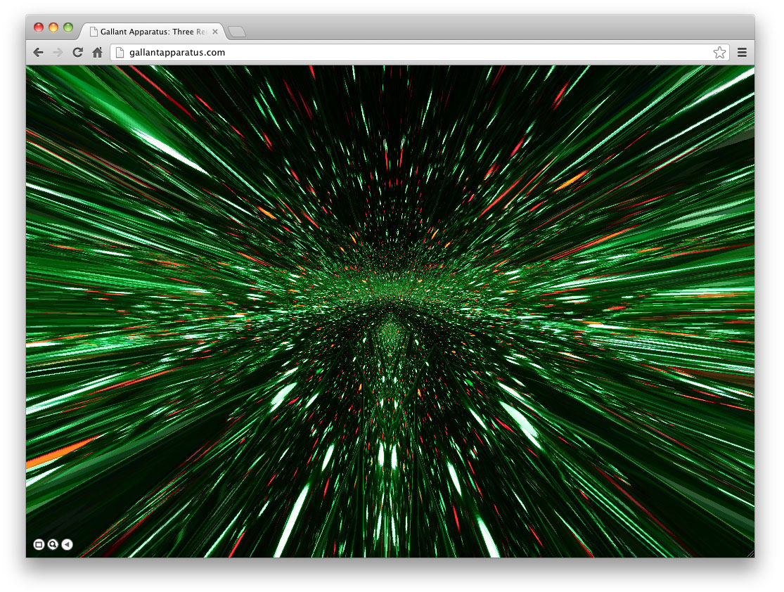
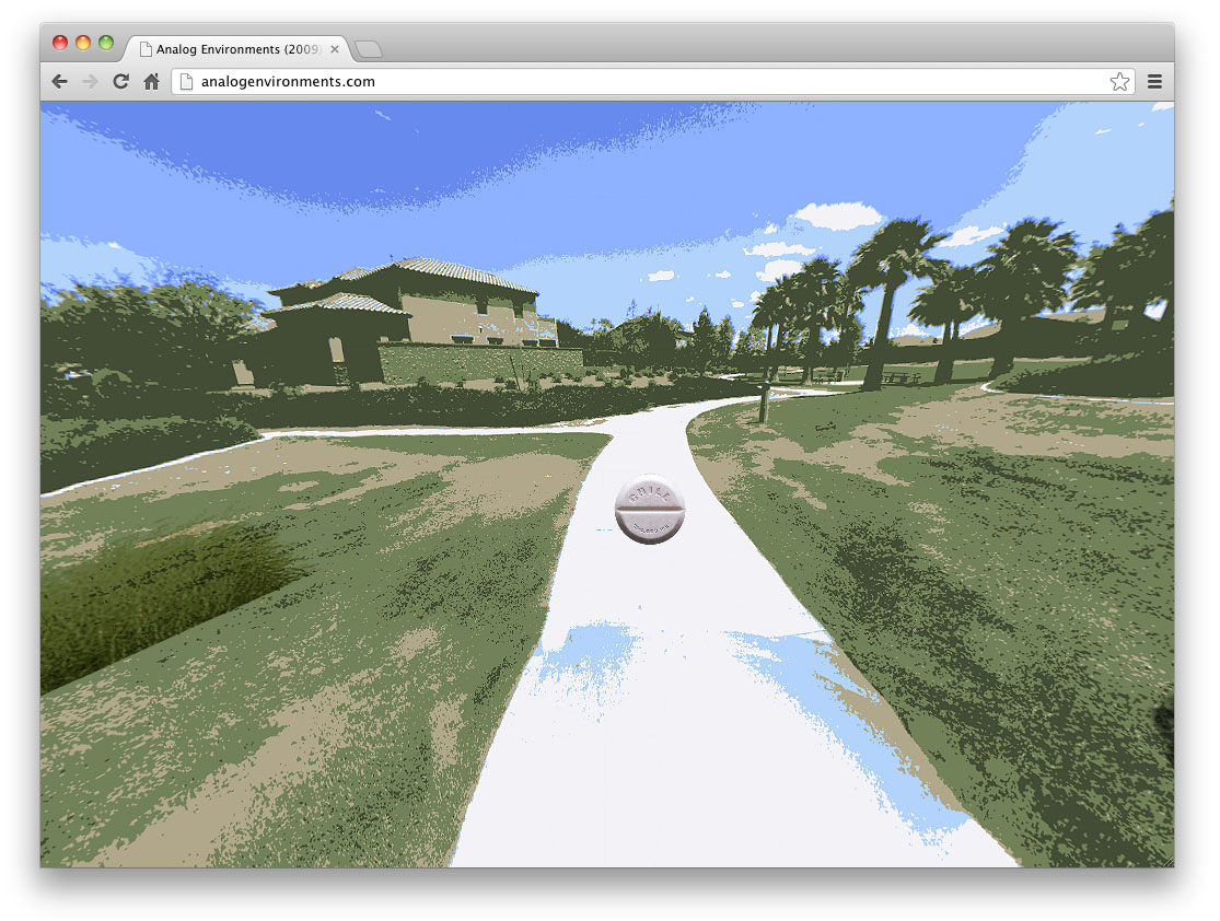
I have recently discovered the great work by Mitch Trale, which is quite mesmerizing including colored and gradient based loop animations running through .swf like the one above from atrophy.in series, and gif layered compositions like in renders.in (showing one on the bottom of the post). Mitch Trale has also created interesting virtual and interactive websites which make the user feel a perfect fusion between virtual and real environments, my favorite one is Gallant Aparatus, due the structure of the virtual space fits very well with the real structure of Yayoi Kusama's installations. See more;


Gallant Apparatus, 2010 

Three Reinstalls After Yayoi Kusama —The Internet obliterates itself by providing a surface upon which an infinite number of sites may exist as independent contextual zones. 


Analog Environments, 2009

"This piece explores the perceived divide between our online and offline experience. The Internet is a projection and reflection of what we think the world is like. Our online reality is as inextricable from our offline reality as any object in any mirror, however distorted.
We use technology to attempt a capture of true sight. The application of photography, holography, 3D geometry scanning, and VR, will inevitably flatten the dimensionality of the world. It's this apparent loss that leads us to believe that digital sight exists on a level beneath analog sight.
I believe that these two sights run parallel, and that each possesses a distinct ability to visualize the superstructure of the Internet, as well as the logics which drive our offline lives."


renders.in, 2010
http://enders.in

"Renders explore the interpretive independence of our web browsing experience. In each piece, a small image is enlarged. The four major web browsers handle this simple request differently. The scaling is not lossy but rather gainful, as new color and dimensional data are supplied by the browser itself. I'm interested in these visualizations because they expose the habitual, textural inclinations of browser software. We view the web through these tools every day, and we become used to the personality of our vision within them."


Cocky Eek

$
0
0


Some great inspirational images from the work of Cocky Eek, using different transparent and reflective materials into natural environments, playing with wind and light forming interesting organic sculptures in the air. Into the post you can see Illumine and Scapes projects, in a previous post I posted several pictures from Blobs and Float (see here) which shows lab set-ups for exploration in equilibriums, floating rooms, and space toys in connection with the human body, interesting too! See more;

ILLUMINE

'The first corporeal form which some call corporeity is in my opinion light.' Robert Grosseteste

They become alive when starting to breath moving their inner light space the skin is the beholder of their integrity preventing themselves for being solved in outer space

Noctiluca miliaris, or “thousand nightlights”, or many people call it the "light of the sea". It is an organism which looks like a transparant balloon with a small tail. It produces that bioluminecense light of the sea, to scare of its predators. One summernight I swom with a transparant costum stuffed with small glow in the dark sticks in the nortsea. I was an obvious enemy; the Noctilucaas started to flash their lights and intermingled with my the "glow in the darks" of the costum. Only a few passengers were witness of a luminous phenomenology and all what's left is a picture of an empty costum after the performance..."


SCAPES

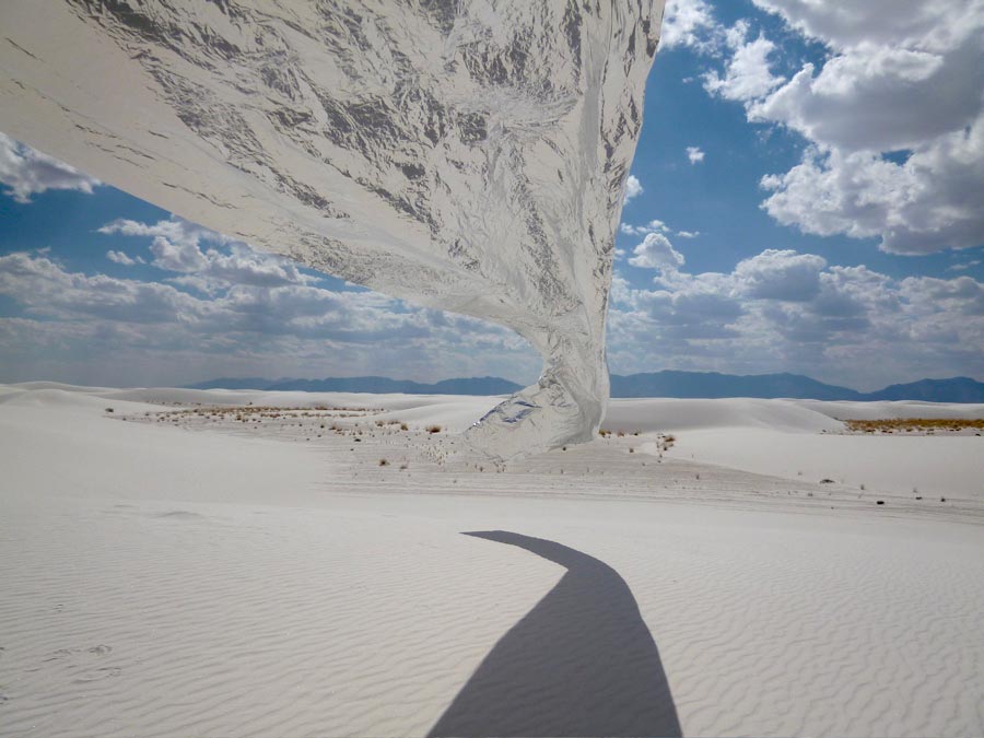
"White Sands Various forms of dunes are found within the limits of White Sands in New Maxico. Dome dunes are found along the southwest margins of the field, transverse and barchan in the core of the field, and parabolic dunes occur in high numbers along the northern, southern, and northeastern margins. These dunes contain solely of Gypsum which is rarely found in the form of sand because it is water-soluble. Normally, rain would dissolve the gypsum and carry it to the sea. The Tularosa Basin is enclosed, meaning that it has no outlet to the sea and that rain that dissolves gypsum from the surrounding Mountains is trapped within the basin. The dunes constantly change shape and slowly move downwind."


Arcades by TROIKA

$
0
0


Arcades, 2012 by TROIKA_
"Arcades is a site specific installation that inscribes one architectural space within another; an arcade made of the light is implanted into a space defined by strong brick walls, a pitched roof and exposed wooden beams, that of a former stable. The arcade is given shape by a series of 14 pillars of light that are met by fresnel lenses refracting the rays that travel through their focal points. When travelling through the lenses, the light beams do not simply change direction but bend hyperbolically to form the arches of gothic architecture." See more;


"Arcades creates a spatial suspension of disbelief which questions our relationship with the metaphysical in a world increasingly governed by practical, rational and scientific principles. By confronting the viewer with the seemingly impossible phenomenon of bending light it creates a space for contemplation and introspection, suggesting a synthesis between agnostic reason and intuitive belief.

The arcade of light lies between the intangible and physical, the visible and the seemingly impossible. It asks the viewer to pause and contemplate the surrounding space whilst promoting openness rather than closure. The illusion doesn't usurp but rather re-enforces the experience of a space. Here, in the spirit of stain-glass, of ‘Lux Nova’, in which spirituality is invoked through light, science invokes the sublime."

'Arcades' is a site specific installation for Future Primitives, Biennale Interieur 2012, Kortrijk Belgium.
30 m (L) x 2 m (W) x 3.2 m (H) Lenses, lights, steel and aluminium


Peter Erskine

$
0
0


"Peter Erskine's "Secrets of the Sun: Millennial Meditations" is a culmination of his interest in the interplay of light, space, and architecture. For thirty years his sculpture has explored the way in which light falls on modulated surfaces. "Secrets of the Sun" uses the emotional impact of art to address the full range of nature from its most elemental expression as pure light to its most complex expression as global ecology.
In "Cromos" and "New Light on Rome" the universal beauty and power of the solar spectrum, one of Nature’s most fundamental forces, is superimposed on the surfaces and structure of some of the most beautiful public buildings in Italy.
Because the sun’s angle, intensity and color continually change with the hour, day, and season, the art, the ancient monuments, the trains and the stations are continually perceived in a fresh, new light." - Peter Erskine's website. See more;

New Light on Rome 2000

"Trajan's Markets Aula and Hemicycle, House of the Knights of Rhodes, Porta di San Sebastiano, Criptoportico of Nero - stone witnesses to a bygone culture in Rome that today needs to be preserved and protected. At the dawn of the new millenium, these two thousand year old buildings are becoming a stage and a backdrop for a Solar Specturm art installation by Peter Erskine.

Erskine uses prisms and mirrors to spread white sunlight into the colors of the solar spectrum. He floods roman arches and columns with rainbows. Changing with the hours and seasons, the art is different every day of the year. The rays of the Sun, the origin of all life, create a fascinating interplay of colors and forms. Here, solar energy and monuments to human creativity unite to form a living work of art in which visitors themselves become creators and participants. We see ancient Rome in a new light."


Cromos: Solar Spectum art in public architecture, 2000 - 2001

"Commissioned by the Italian State Railway, Ferrovia dello Stato, Peter Erskine has created solar spectrum environmental installations in Rome Termini station, Florence Santa Maria Novella station, Milan Central station and on 30 EuroStar high speed trains running between Rome and Milan.

The geographic and architectural scope of the project probably makes it the largest artwork in the world. Over 5000 square feet of specially designed prism material were used including over 3.5 miles of prism in the 30 trains. However, the total project weight of all prism material used is less than 150 kilograms and virtually all the art materials will be recycled by the artist.

Ecologically, the Cromos project is an example of the "sustainability" principle of doing much more with much less."


Spectrum of Time, 1999

"Spectrum of Time" is a permanent rainbow sundial calendar installation in the Kokerei Zollverein, a United Nations Historic Preservation site. Hour and month lines painted on the walls and floor of the 40' X 40' X 40' industrial museum space mark the hours, summer and winter solstices, and the spring and autumn equinoxes with astronomical accuracy. A 30' X 30' cross of solar spectrum light powered by the rotation and tilt of the earth tells the time and date. On cloudy days a laser pointer driven by a solar tracking program fills in for the rainbow.

Spectrum of Time, Rainbow Sundial calendar. Visitors walk inside a living map of the solar year. Each "Rainbow Sundial calendar" is a unique joining of astronomy, architecture, locale, and art.


Sunrise, 1999

"Sunrise" is the first art experience in the Kokerei. Riding in a people mover, viewers ride the 400', 20 degree incline following the dark path of the coal in its original conveyor belt tunnel. As they rise, the viewers travel through a fog inlluminated 400' long 10' high solar spectrum beam, and pass through the changing colors of the rainbow. When they disembark on the factory roof they see the solar powered 8' X 8' heliostat solar tracking mirror, and solar prism that create the art.


Pinar & Viola

$
0
0

Scandal Aqua - Thrill Seekers Leaked — Ecstatic Surface Collection 2013

“Totalitarian, decadent, monstrous and sexy” this is how Pinar Demirdag and Viola Renate describe their aesthetic. The two girls form an independent design studio based in Amsterdam called Pinar & Viola. They create hyper detailed surfaces, made of digital collages and ornamented by excessive and sparkly embellishments.

I met Pinar in a café in Paris. Viola was unfortunately busy. I discovered a very intelligent and serious girl with a very cute Turkish accent. This is actually one of the first times that an artist was so clever in answering my questions and so good at explaining the meaning of her work. She knew exactly what she was saying. No bullshit. Before meeting her, I was already a fan of Pinar & Viola aesthetic; I loved their avant-garde vision and very girly style. I discovered while talking to her, that their work was not only about aesthetics but was also about social criticism. For an hour, we talked about kitsch, politics, social anthropology and fashion. See more;

▼ Read the interview ▼

Dora Moutot (DM) interviews Viola Renate from Pinar & Viola (PV)

DM: To me you're a bit like a new digital girly version of Pierre and Giles. Take it as a compliment!
PV: We don’t considerer ourselves as a new version of Pierre & Gilles even though we have similar aesthetic. We prefer the comparison with artists duo Gilbert & George. They do not only work on visuals, they are also political graphic activists. Just like us.

DM: So what is your work about? Kitsch and politics?
PV: Our work is about presenting criticism in a golden package. We intend to bring back the value of ornamentations. We create conceptual ornamentations. We work on surface and the surface is the message. We believe in luxury and we think that we should not deny the pleasure of extreme decadents. We believe in the power of opposition, in clashes, in tensions. We’re inspired by folk amateur aesthetics. Without following rules, the very guanine and the very fake inspire us. Most designer tries to apply an “elite style” and we wanted to try to get away from that.

DM: How do you work together? Who does what?
PV: We have the same role, it’s not like I make the design and she’s the assistant. We’re two but most of the time we use the help of other people. We take them in! Interns, PR, video producer… Our work schedule is: replying emails, answering interviews, teaching, giving lectures, researching and creating. The research for the concept takes a lot of time. We divide tasks. We work separately and when we believe it’s presentable to the other one, we put our work on the wall and we have a look together. Usually then we exchanges our files and the other one finishes the work of the other. But when we started, we didn’t do it like that. We were seating in front of the same computer for hours! But really, the research part takes so much time! We just get lost on the Internet.


4eva, Love message Service — Capsule Ecstatic Surface Collection 2013 - www.lovemessageservice.com

DM: I know what you mean by getting lost online! I can relate to that!
PV: And we love it! It’s our favorite hobby. That’s what we do on your Sundays.

DM: Where do you get lost online?
PV: On stuff, it’s crazy! Most of the time, we find interesting things on Google image search. We type in whatever! Which leads us to a website, then we read an article which leads us to another blog. Or sometimes we get lost on Tumblr and we go from one Tumblr to another…you know how it works!

DM: Yeah and then you spent 5 hours and it felt like a minute!
PV: It’s amazing! If I had my computer, you would see all the different windows open with of all sorts of websites, blogs about fashion, art, news. I probably have like 60 different bookmarks! We built an entire library of images.

DM: So, do you use images from the Internet in your work or do you shoot stuffs?
PV: Both! For some videos, we have to use copyrights. We also organize professional shootings with models and make up artists. But we also believe in taking from the Internet. We don’t really believe in copyrights whatsoever!


Pinar & Viola using and recommending at their blog www.virtuagirl.com

DM: Me neither. It doesn’t really mean anything anymore with the Internet...
PV: Yeah I even believe it’s archaic! We believe in taking from the Internet and giving it back to the Internet. For example, in one of our last work, called Aqua, the guy is a model. We shot him, we spent months to find him and we commissioned a stylist. This guy is a bit Italian, a bit Turkish, a bit French…

DM: Yeah you don’t really know where he comes from when you look at him.
PV: He’s just handsome and corrupt! We do most of the graphics or sometimes they come from the Internet but are totally manipulated by us. We almost nether use things like we find them.

DM: Do you think you would have the same aesthetic without working together?
PV: Not at all! My aesthetic was dramatically different before. I only used illustrator and didn’t use Photoshop! I was more into typography. Viola was into Photoshop. She had a very chaotic style, not structured at all. But in a nice way!

DM: A lot of your recent works is about interacting with people on the Internet. For example with the panda photo booth and the love message service! I signed up for the love message service by the way!
PV: Ahaha Great! Did you receive any love messages?


4eva, Love message Service — Capsule Ecstatic Surface Collection 2013 - www.lovemessageservice.com

DM: Yes I did! I even told my single friends to sign up! So yeah, why do you want to interact with other people through your art? 
PV: With social medias, I believe it’s kind of impossible to claim yourself a contemporary artist without interacting! Of course you can choose another medium and it’s your choice but our medium is digital. We live in the digital environment. We also think that the Internet should be free fun! We have free fun on the Internet, so why don’t we create free fun if we can?

Most of our work rises out of a contemporary happening, a contemporary desire. Internet enables us to be optimum all the time. I just downloaded this Parisian metro map and I could get here to meet you so easily! Everything is getting more and more easy and free. So if we are inspired by the contemporary world, this is what we get inspired by and this is what our work should reflect. This love message service is a reaction to… well let me explain. Last year we were assigned to talk about optimization on the Internet. While researching for that class, we discovered that there are services where you can “buy” a fake girlfriend who will write on your Facebook wall.


Optical Illusion Selfies at overlayer

DM: I read about that. Isn’t it genius?
PV: Yes it is! It makes all your friends jealous. This was a total inspiration! And we thought, how can we put in on the next level, and give a certain level of criticism? So we made this very eccentric and tacky aesthetic for the homepage of the service. The guy will send you 10 messages. We created a real boy, very glamorous who writes to you in a dirty sweet language. But when you look closer and pay attention, you’ll see that the lover has a snake tattoo…

DM: Oh I see…I get it!
PV: It’s about ambiguity. For the panda photo booth, it was a reaction towards transparency and anonymity. Internet is transparent, “I just checked in, I just checked out”. We believe there is a real need and demand for opacity on the Internet. Opacity in the new cool. The panda is a reaction to that.

DM: Because you can hide!
PV: Yes, but you’re still sweet! You’re a cute panda. I believe that if you want to go against something by saying, “you suck”, you cannot make a conclusion and nobody will listen to you. If you make things more fun, then it’s fine to be against things!

DM: The Panda photo booth was created for fashion stylist Nicholas Formichetti right?
PV: Yeah we are currently in contact with him! He asked us to design patterns for Mugler’s upcoming collection; we were totally ecstatic about it!
DM: Wow! That’s awesome!
PV: But then he decided to change the design direction. We were so sad!

DM: Seriously! I don’t really like what he does at Mugler right now. His work at Dazed and Confused and at Vogue Homme Japan as a stylist was sick tough! But it sounds like a huge mistake to me, to not take you on board for the collection.
PV: You must give credit to the zombie technology Mugler collection! It was CRA-ZY!

DM: Your work is related to fashion. You already created patterns for different brands. Would you considerer doing a Pinar & Viola fashion collection?
PV: Our works stands in between a lot of things: social anthropology, fashion design and art. Fashion is a direction we would like to go more and more but we don’t considerer ourselves as fashion designers. There are so many masters in the world and our aim is to be the best at what we do. I can’t exactly pinpoint what we do, a combination of these things but I rather work with someone who’s best in their own job, best at designing fashion in this case. I’d like to design the patterns but also design the whole visual experience, the catwalk etc. If everything goes right, we will open the Amsterdam fashion week in September, with an Amsterdam based French duo called Maryme-JimmyPaul.


Skeumorph — Pattern design for the fashion label This is Chorus

DM: Would you like to work with someone in particular?
PV: We would die to work with fashion designers Victor &Rolf! We always admired them! 

DM: What about the net art scene? Is there any people you admire or you feel related to? 
PV: It would be a lie if we said that we are not related. We have similar fascinations but we’re totally allergic to already exciting overdone trends and I’m afraid the Internet has the tendency of making people copying each other. But yes, we have similarities because they look up to contemporary youth so it’s impossible to not have a similar approach and certain subjects repeating it selves. But the very execution of the work is dramatically different. We’re not spending 2 minutes on framing a Tumblr image and then calling it art. It’s unacceptable to us. We’re allergic to dolphins, palm trees…


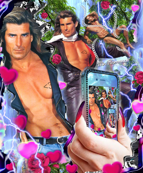
Fabio, a.k.a Mr. Romance — Artwork for BULLETT Magazine

DM: To seapunk?
PV: There is this guy, Zain Curtis (http://teenwitchfanclub.com), we’re online friends, we have total respect for him. This dolphin, palm tree thing emerged from his and his friends minds but anyone who came after him…

DM: Yeah it’s totally crazy how this dolphin and palm tree aesthetic became so popular online.
PV: I have an idea about why people get followed. It’s about having a never-ending passion and desire. And it’s about courage! Most of the time these people are considered by conformists as crazy and by mainstream as cool. I think that people who don’t dare to be crazy enough and to have their own passion find solution in copying the courage of other people. This guy, Curtis, is just a nerd! He does things in his own way.

But…to be honest, ahah, I have a big mouth and I’m saying you shouldn’t copy people but…yeah well, of course you should copy people! When you have nowhere to go, what do you do? In order to find your own personality, you should start somewhere and the first thing I did was to copy.

DM: I discovered your website a few years before Tumblr became this big “kitschy” network and I was so surprised and happy to discover that other people had the same aesthetic than me! How did you feel, when this aesthetic became “à la mode”? Did you see it coming?
PV: We didn’t felt that it was coming but we felt that it was needed. We can’t really say that we have been inspired by anyone in this aesthetic. And then we discovered your website, La Gazette du Mauvais Gout, and we thought that it was intellectual and researched, not only purely aesthetic and we thought that it was really interesting.

Diva Opaque, Anonymous Guardians of Intimacy — Ecstatic Surface Collection 2012

For example with this “Iraki Swag” you can see online…sorry to put it that way. We made a collection with all these veil ladies, before MIA’s video. We did it for a good reason. It was because of opacity and because of Wikileaks. We did it because of Geert Wilders, this crazy Dutch extremist politician. He’s anti-Muslim. As a Turkish girl living in Holland, I don’t cover my hair but I’m affiliated to this religious beliefs. I was so chocked to hear that if he were chosen, he would charge people for wearing a veil. We had to do something. So the gesture of making desirable women as veil divas and calling it “ Diva opaque, anonymous guardians of intimacy” had a political reason. It was politically engaged! It was a real necessity, instead of a stylish sensibility. After that, we saw that crazy headscarf mania booming.


Diva Opaque, Anonymous Guardians of Intimacy — Ecstatic Surface Collection 2012

DM: All the designers were doing it. Comme des garcons, Killian Lodo, Dis Magazine!
PV: It spread to the catwalk; students from the fashion school of Anvers were doing it.

DM: Yeah like Manon Kundig. I interviewed her for Triangulation (here).
PV: It was in the air. With the Arabic Spring. It’s not like we invented it. Fatima Al Qadiri was always busy doing that kind of stuff and MIA was making a reference to Arabic gifs without using veils in one of her video, so it was in the air, but not in the form of headscarves! And then we saw all these designers making meaningless works with beautiful headscarves. When we saw the headscarf editorial on Dis Magazine, something broke inside us but this is how it works!

DM: According to you what is avant-garde right now?
PV: I can’t tell you that! People pay us to tell them. We give advice to brands. We’re in close contact with Nike. But you will see it in our next art collection! It’s not about the Internet. Our collection will be about something quite invisible, yet I know it will be there in 10 years in mainstream.

DM: Can you tell me a bit more about Aqua, your last graphic design collection? As you said, you always try a fantasy scenario reflecting a happening; a sensation or a change, which you believe, will mark the years to come. So please, explain me in which sense this project reflects a sensation that will mark the years to come.
PV: This project is about the media coverage, the over exposure of politicians. Sex scandals. We’re so used seeing Obama on the cover of People magazines. Saying he cheated even though it’s not true. It’s also about politicians having twitter accounts. The line between folk and elite is becoming more and more tiny.


Scandal Aqua - Thrill Seekers Leaked — Ecstatic Surface Collection 2013

The project is also about social media and the emancipation of woman. With social medias, the border of what woman can do is really stretched; we’re living in the edge of objectification and emancipation of woman. With showing your boobs and your abs online, the question is: it is more about telling the world you can do whatever you want as a woman or is it about presenting yourself as an object of desire? Of course, men also do it, but we wanted to study it from the point of view of a teenage girl.

The scenario we proposed in the AQUA collection is scary. It’s about politicians emerging on teenager’s bathroom towels!


Scandal Aqua - Thrill Seekers Leaked — Ecstatic Surface Collection 2013

DM: Do you think it will happen?
PV: It’s a farfetched scenario. It’s not really important if it happens or not but I wouldn’t be surprised if posters of politicians appeared! Probably not as kitschy as we did it, but a simplified version of that, certainly! Some people asked us if the project was about an imaginary politician trying this technique to speak to the youth. So people are already thinking about that! It’s in the air.

DM: Which software do you use? Your work seems to be quite technical to me!
PV: Is it? No! We use Photoshop mainly.We have a video producer who does stuff for us: José Miguel Biscaya (jmbiscaya.com), he’s a wizard! And for the panda photo booth, Hilal Koyuncu (parsons.hilalkoyuncu.com) made the application. And our intern Gui Machievelli (guimachiavelli.com) made our HTLM for the love message service!


Courtney Stodden — Artwork for BULLETT Magazine

DM: One last word about your work and the wonderful world of the Internet?
PV: Life happens on the Internet! I stay more at the window of my computer than on my flat window. I don’t considerer safari as a bunch of animals anymore. IRL is the replica of the dirty underground streets of the Internet. IRL is the mainstream of the streets of Internet.

DM: I couldn’t agree more!


Interview by Dora Moutot for Triangulation Blog - March 2013 
Dora Moutot is a young journalist specialized in fashion within the digital culture. She is the founder of La Gazette du Mauvais Gout where she writes about bad taste, eccentric and kitsch trends. www.doramauvaisgout.tumblr.com


One gif compositions by Evan Roth

$
0
0


Mesmerising GIF compositions created by the animation and repetition of one single animated GIF over the website, each piece it's hosted in a different domain, this is an excellent work by Evan Roth! See more;

A Tribute To Heather, 2013

"A Tribute To Heather is a collection of ten new One Gif Compositions (next work featured in this post) created from single animated gif files found on Heather’s Animations. Heather’s Animations is a hand crafted personal archive of early Animated Gifs that has remained online, free for all and relatively unchanged since 1999." 


"One Gif Compositions are a series of web-based pieces that use found animated gif files to create visual motion studies. Unique animation cycles are formed based on how the browser downloads and caches each of the individual .gif files over time. Each .gif in a given sequence is given a unique file name, convincing the browser to treat them as different images rather than copies of a single file."


Mesmerizing websites

$
0
0

Gifmelter, by Chris Shier & Tim Baker

I'm impressed about several websites I have discovered recently. They create a crazy abstract visual experience, I like the flow by interacting with them, how fast and well they work and also the chaos they generate by submitting a source. 
Into the post you can see 3 pieces, each of them created by a different artist, the first one is called Gifmelter, by Chris Shier& Tim Baker, where you can upload an animated gif and let it flow by interacting with it. I'm really looking forward to see what's next from Noisia, he has created so much good work in the last months (check out these 2 previous posts; 1, 2).
The second image into the post is from a website by David Kraftsow aka dontsave, called yooouuutuuube.com, where you can enter a Youtube video url and select three different modes such as feedback, zoetrope and mosaic, which is also awesome to see an entire video being distorted through all these modes in real time. Btw I didn't know before the work of David Kraftsow, and I didn't like only the piece I just mentioned but several of them lined up on his website, I like how he works visually but also conceptually, this is quite beautiful piece http://dontsave.com/waterfall_tracking/.
The last image is from a new work by Andrew Benson, called Radical Paintings, this piece doesn't take external imagery source, but I love it as I do with the visual work by Andrew working through video, it's great to interact with his acid visuals finally on the web! See more;


Gifmelter
by Chris Shier, gif.js by Tim Baker


Yooouuutuuube
by David Kraftsow


Radical Paintings
by Andrew Benson


OFFLINE ART: new2

$
0
0


XPO Gallery presented two weeks ago a new exhibition titled OFFLINE ART: new2 curated by Aram Bartholl who has also created the new offline format exhibition for this show. The exhibition will be running until next 5th April 2013 in Paris. 
Once else Aram Bartholl brings the online content to the physical space and show it offline, which opens the debate again about if it makes sense to show net art in a real space and other interesting questions which were mentioned by Olia Lialina in the great speech she did during the opening of this exhibition, you can read it into the post.

"new2 is the first show realized in the OFFLINE ART exhibition format. Web-based art works will be disconnected from the Internet but accessible via a wireless network. A high-profile selection of twelve artists from various 'Internet generations' (Cory Arcangel, Kim Asendorf, Claude Closky, Constant Dullaart, Dragan Espenschied, Faith Holland, JODI, Olia Lialina, Jonas Lund, Evan Roth, Phil Thompson, Emilie Gervais & Sarah Weis) - all of whom work digitally and online - will present both old and recent works. OFFLINE ART: new2 is a group show about files, versions and copies that question the idea of endless 'novelty' in an era of daily remixing on the Internet. A digital file can be copied endlessly, without any loss of quality, thus enabling a web culture of nonstop creating, sharing and remixing files, which has influenced an entire generation of artists." See more;

Read all the press release and everything about each artwork exhibited, here.

The following text it's a speech by Olia Lialina in the opening of OFFLINE ART: new2, curated by Aram Bartholl at XPO Gallery.


Let me steal a few seconds of your attention to remind you about some obvious facts and terms. The Internet and the Web are not the same. The Internet is older and bigger, it is a distributed network born in 1969 and turned into a global Internetwork at the very beginning of the 80s.

The Web is younger. In two months we will celebrate its twentieth birthday. The first cross-platform browser, Mosaic, was released to the public in April 1993. There are people who date the beginning of the Web to 1989, when Tim Bernes Lee invented the WWW system, but nothing happened between 1989 and 1993. Nothing before the rest of us started to shape it.

The Web is younger and “smaller.” It began in 1993 as a modest service, one of many. I have a book here with me, “The Whole Internet” – I always have it with me. It has 400 pages and only fifteen of them are about the Web. But it was growing very fast. By 1995, it would make no sense to write a book entitled “The Whole WWW” or something similar, because it was already immense by this time.

The Web became the Internet very quickly. In the 90s many got to know about the Internet through the Web. Many never ever left the Web, so they haven’t seen the rest of the Internet. In the new millennium, most of the users don’t even know there is a difference. I sometimes get angry at new students who don’t know about it, but at the same time, I’m fine with this because the Web is the best thing that happened to the Internet. The best thing that happened to us. It is the best thing that could happen to artists and to the contemporary art world, though not everybody would agree with this.

Apart from the many doors and windows that it has opened to artists and institutions, the Web gave life to a very important movement: net art – or, as one would have called it during the mid 90s, net.art.

Retrospectively, we can say that it gave life to two art forms: web art and net art. The first was busy with browser, HTML and scripts, with the idea – revolutionary at the time – that a browser IS a place for self-expression, for experimentation, for making art. Net art was busy with networking itself.

In the beginning, web and net art were represented by the same people. They – I mean, we, worked for the Web, on the Web and because of the Web. But we didn’t want to be called web artists; we liked being called net artists. The reason is that, for net artists, visual and coding experiments with browsers were less important than the fact that our works were ONLINE.

Artists of that generation emphasized connectivity, networking, and the distributive nature of the works through several means. There was a great desire to create projects that weren’t visible on a computer that was NOT online. Today, we often hear that there is no difference anymore between offline and online, that they are both real life. True. Twenty, fifteen years ago, we knew very well when online stopped and offline started, where net art stopped and where CD-ROM, interactive or whatever art started.

A show that goes back to the initial idea of net art opens tonight. It focuses on connection, its presence, and its absence. It even starts off with a provocative title. I don’t know what you think about when you read OFFLINE art, but I can only think about ONLINE art.

OFFLINE ART: new2 was curated by one of the most important new media artists, Aram Bartholl. His objects and installations in public places precede today’s art and design trends that play with the relationship between the digital and analog worlds. But he is also a net artist, a classic net artist, because he keeps himself busy with the question “am I on or off?”

This question was and still is central to net art, despite new realities, new devices and generational change.

Aram is also a brave artist, because he is not afraid to enter into one of the most slippery issues related to contemporary and media arts: Does it make sense and is it possible at all to show net art in a gallery or real space?

I have been involved with this discussion for the last fifteen years through my own artistic and curatorial work. I can tell you that the answer has changed from a definite No to Maybe, to Yes, but and finally, to Yes.

It became clearly positive some years ago, when the Web stopped being a new medium and became a mass one. It was quite a difficult moment for net art and web art, because these forms are extremely medium-specific. Web artists and net artists are doing work about the medium, but, as soon as it stops being new – when it a matures, when it becomes a mass medium, it becomes very difficult to have a close connection with it. By the way, many net artists went OFFLINE at that time to make works “about the internet and the web” from the outside, in order to keep a distance, to keep the relationship alive.

But there was also a bright side to this: the fact that the Internet became a mass medium meant that net artists got bigger audiences, both online and offline. Ten years ago it made sense for net artists to only address people in front of their computers; today, I can easily imagine addressing visitors in a gallery because most of them have just gotten up from their computers. They have the necessary experience and understanding of the medium to get the ideas and jokes, to enjoy the works and to buy them.

What is especially interesting about today’s exhibition is the fact that it counts on people who came not only with knowledge but also with their own mobile devices. So you are here and you are in front of your own computers again.

How to show net art in the real space? Another eternal question

OFFLINE ART is not Aram’s first answer to it. Three years ago, he conceptualized Speed Shows, an exhibition format that suggested renting an Internet café for one evening and opening online works on computers in a standard browser with standard preferences. It was a great gesture and I’m happy that these series of events still happen all over the world, because it is important to go to Internet cafés, to sit at least once in a while in front of a public computer. It was great for net art because a standard computer with a standard browser is a natural atmosphere. It is much healthier than installations and custom built objects around a work that only needs a browser. “Net.art never died! It just moved to your local Internet-shop!” was the motto of the series. The paraphrased motto of OFFLINE ART could be “net.art never died! It just moved to your local network!”

Once again, Aram suggests showing (distributing) the works through standard devices – Wi-Fi routers. They are modified, though. One router, one artist, one work of art: one network per artist. It is elegant and almost absurd.

This can be very attractive for collectors, who were always warned that you couldn’t buy net art; for this, you’ll have to buy the whole network. Well, here it comes, the artwork and the network.

I’m sorry if it sounds a bit sarcastic, but it is not because I’m against selling. I think, and I have repeated this for fifteen years, that selling web art is easy. Any other art form is more problematic than a web-based one, especially when it comes to pragmatic and legal issues. Additionally, there are so many ways to do it, so many ways to reshape and re-contextualize, to keep and collect. OFFLINE ART is an example of how it can be done.

We can try to see today whether this setting works and how it works. Will you look at the router or will you look at the work it is transmitting? Will you go through one router to another, or stay for hours in front of one? Will you keep the files you’ve downloaded on your devices and transfer them to your nextphone or overwrite them immediately?

You can access the works of twelve artists who belong to the tradition of web art through the routers, and then buy the routers. For OFFLINE ART, Aram selected classic and new works that play with web culture and browser aesthetics. They are all accessible through browsers, not apps. I think it is great to do this in 2013, because at this moment it looks like apps are taking other, but it is not true. Web designers and browsers will adjust to the small screens in the near future and the Web will once again become the environment we are in, even on mobile phones.

As soon as you connect your devices to each of the routers you will get a beautiful piece of web art. The exhibition itself is a wonderful net art project. Thank you for paying attention to both, for keeping both movements alive

Olia Lialina, 21 February 2013

Images courtesy Aram Bartholl, check out the whole album here.


Ryoichi Kurokawa

$
0
0


Ryoichi Kurokawa has created a new minimalist and beautiful audiovisual sculpture called Oscillating Continuum where the digital visual and physical structure merge perfectly together.
He has also uploaded this week an audiovisual concert from 2011, performing with two channel  projections and 2.1 channel sound. You can see an excerpt of each project into the post;

Previous post of Ryoichi Kurokawa; 1, 2


oscillating continuum, 2013
2ch HD suqure display, 2ch sound - 08'00" loop


syn_, 2011
2ch projections, 2.1ch sound - 30'00" - 45'00"


Joe Hamilton

$
0
0


Trouble in Utopia and Survey are two recent good works by Joe Hamilton. Both projects work under the disorientation and hyper-reality created by Joe working through animated collage, numerous layers, transitions and different perspectives. The first one was created for BYOB Melbourne 2013 which took place at the new RMIT design Hub building designed by Sean Godsell in Melbourne. As Joe Hamilton told us; "the video work Trouble in Utopia is about the building. The building is quite brutal and moderist which really appeals to my taste but at the same time the starkness of the concrete and metal surfaces is quite dystopian. The piece is about these contradicting thoughts about the building. The title for the piece was taken from an episode of the documentary series shock of the new by recently deceased art critic Robert Hughes. The episode is about modernism's failure to bring about the utopian city through architecture." (Into the post you can see the video but I recommend to see it at the project page as the video works together and synchronized with several backgrounds which makes the entire piece.)
The second piece into the post titled Survey is quite crazy, this time Joe has used real video footage and did an excellent exercise of tracking, by attaching onto the building and its outdoor another imagery source. I also like how he complemented the perspectives and structures with flat green plans which fit perfect but at the same time make a big contrast with the high presence of vegetation. See more;


Trouble in Utopia, 2013


Survey, 2013


Taiyo Onorato & Nico Krebs

Christian Herdeg

$
0
0


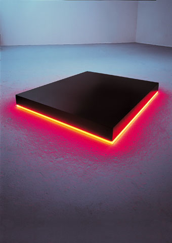
Here are some light sculptures and installations by Christian Herdeg since 1978 until 2012, using neons tubes and  black lights, and combining these black lights with fluo acrylic paint which creates some beautiful soft gradients, you can appreciate this effect in those pieces into the post made in 2012 such as Magic Circle meets Square, Large Kite, Kite and Ventaglio, love them! See more;

Lichtschleuse II, 2007
Neon and argon light tubes, total length 12 m


Neon/Argon square, 2011
Neon and Argon light tubes


Magic Circle meets Square, 2012
Fluo acrylic paint, blacklight tubes


Large Kite, 2012
Fluo acrylic paint, blacklight tubes


Kite, 2012
Fluo acrylic paint, blacklight tubes


Ventaglio, 2012
Fluo acrylic paint, blacklight tubes


Neon Stage, 2011
 77 Argon and Neon light tubes, multiplex platform


Small Disc Orange / Turchese, 2006
MDF disc, paint, Ø 130 cm


Small Square Yellow / Blue, 2007
 MDF panel, paint, 86 x 86 cm Argon lightcircle, Ø 82 cm


Day and Night Passage, 2005
MDF panel, paint, 66 x 74 cm Argon lighttube, 242 cm


Floating, 1999
MDF panel, paint, 14 x 236 cm, Argon lighttube, 254 cm


Step-On III, 1978
Granite block, 8 x 84 x 100 cm, Neon lighttube


via | Nick Faust

Kite & Laslett

$
0
0


Kite & Laslett is the artist duo formed by Sebastian Kite and Will Laslett, trained in architecture, sound and music, specialise in producing architectural interventions in the form of interactive installations. Their cross-disciplinary projects fuse sound, light, film, performance and sculptural elements to construct immersive experiential environments that challenge human perceptions of space. See more;


ORBIT, 2012

5x custom built 400mw laser motorised armatures, custom software - audio/light triggering 2.5m (D) circular canvas


PANOPTIC, 2009-2012

It was created for platform79 - the berlin project Kite & Laslett produced two artistic interventions. The first, Panoptic, is a physical mobile-installation situated in Courtyard IV of the former Kantstraße Women’s Prison, exploring visual space. In contrast, Klangzelle, a sound installation, examines solely aural space and the acoustic energy of the prison interior. The two works stand in relative juxtaposition to one another, both architecturally and in conception.


Canopy by Rick Silva

$
0
0


Rick Silva has created a new work which was presented last week at Domain Gallery. It's a beautiful loop piece working through a downloadable application made with Unity 3D, you can download it into the post or at the same gallery which will run the work until next April 15, 2013. 
The work is called "Canopy" and is the first work Rick made after recently moving to Oregon. It’s inspired by his new surroundings. Canopy presents a natural digitalized environment created by 4 trees which surround the viewer, these trees spin all together around the viewer who is the central axis, creating a centered and circular composition because of the passing of themselves. 
I also like the format where this loop piece is presented, I usually like loop pieces which starts and finishes with the same thing/visual/frame, I mean continuously, without cuts on the visual. But as this piece has been programmed, it starts in one way and then it loops itself as it was a continuos loop, this is something we can't get with formats such as video or animated gif because of the lenght and weight of the file. See more;

Download here (Mac & Pc, it goes all together into the same zip)


Diffraction by Mitch Payne

$
0
0


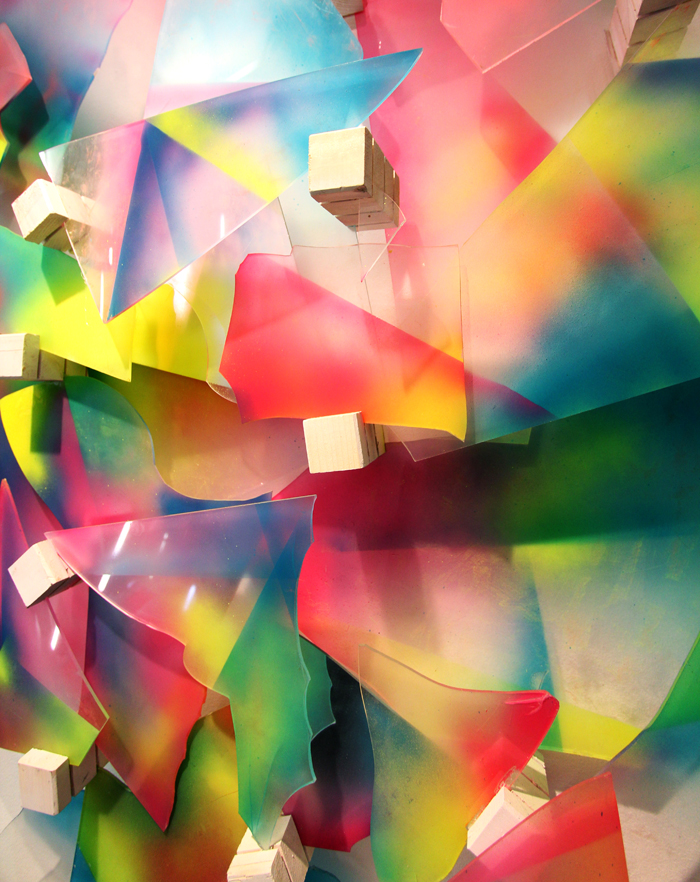
Diffraction is a photograph series created by Mitch Payne, consisting in several abstract colorful compositions made using opaque and transparent forms and shapes where the light is reflected. See more;


Clemens Behr

$
0
0


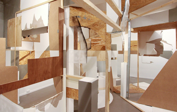
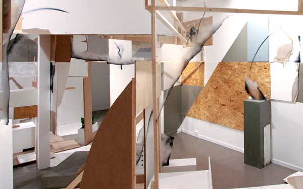
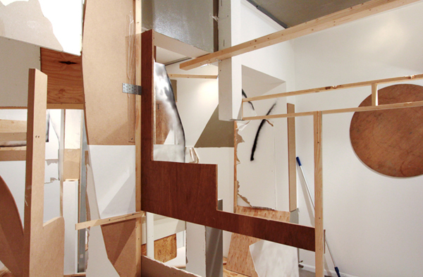
Clemens Behr's work is based on abstract installations and sculptures built in both public and interior environments. These three-dimensional and volumetric collages which usually are dimensionally huge are made of found recycled ephemera as well as basic building materials such as cardboard, wood, paint, tape and found materials. Into the post there are some works from 2012 but I recommended to see his great portfolio.

“My work is complicated, inexpensive and improvised…My process all begins with the space, which acts as a basis for planning. The space defines the colors and shapes, as well as any fixing or mounting possibilities and the dimensions of the piece.  I can’t plan that much in advance, because I can never be certain which possibilities and machinery will be available for me to use. Once I have the composition or an idea of the finished piece visualized in my head, I usually begin to paint the cardboard. Then a wooden frame is screwed together onto which the cardboard will be fixed. This occurs very haphazardly. Before I travel to cities like Delhi or Marrakech I do no preparation before. I just look at the city’s colors and shapes and try to adopt it in to my work. In general, the way I work should be a kind of transformation of the architecture. It pulls everything apart and assembles it in a new geometrical disorder. The source of my inspiration can definitely be traced back to the work of Marcel Duchamp and Kurt Schwitters, and I would name Gordon Matta-Clark as my favorite artist.” - Clemens Behr for Futurism 2.0. See more;

Suspended Bins & Broken Windows, 2012 


Seize Marseille, 2012  


The image below is from a duo show by Clemens Behr and Nural Moser called Rauminstallation mit Pumpe (und andere Sachen), curated by Open Walls Gallery and will open at Stattbad, on April 13th. 
"The artists will present a large-scale sculptural piece inside one of Stattbad’s large empty swimming pools. The two artists' collaboration is a moving four-dimensional installation combining Behr’s trademark improvised abstract work and Moser’s sound piece. The sculpture is set in motion through the water being pumped from the pool triggering small mechanisms articulating and animating the whole piece. The show will also introduce the viewer to different types of works by Clemens Behr: paintings, silkprints, objects, as well as some of Nural Moser’s architectural printed collages." 


FERÉSTEC

$
0
0


I like Feréstec works and how he combines painting, footage and other media with graphic user interface to compose the final layout or generate numerous patterns of details of the same piece. Here is some new work since I published his work last year. See more;


Modulate 5.1

$
0
0


I'm discovering good stuff by renting some video art lately. I will post here my favorites still images or videos if they are also online. This one called Modulate 5.1 is a collection of sonic visual pieces, exploring movement, colour, shape, non-verbal expression, internal journeys and spatial awareness. A collaborative project released in 2006 between Mark Bunegar, Mark Harris, Scylla Magda, Bobby Bird and Joseph Potts. 
It is great that all the pieces from this project are online, I put all of them in order into the post, anyway they still sell the DVD by contacting with Modulate. See more;

01 wave


02 red


03 motion


04 twist


05 embroidery


06 green


07 sunblind


08 create


09 blue


10 temple garden


Viewing all 185 articles
Browse latest View live